Fundamentals
Modal Presentations 101
Learn how to recreate Apple's Shortcuts app in this step-by-step tutorial. We'll start by using the Full Screen Cover and Sheet modifiers, and then explore additional modifiers to customize these modal presentations.

In iOS development, a Modal Presentation refers to the display of content that temporarily interrupts the normal flow of your app's interface. It appears above the current screen, in a separate, dedicated mode.
Presenting content modally is effective for:
- Contextual Information - Display additional details, settings, or supplementary content related to the current screen.
- User Input - Capture user input or prompt for decisions without navigating away from the current screen.
- Alerts and Notifications - Communicate important information or alerts that require immediate attention.
In Judo, you can present content modally in either a Sheet or a Full Screen cover, depending on what you are trying to achieve. Can you spot the Full Screen and Sheet presentation?
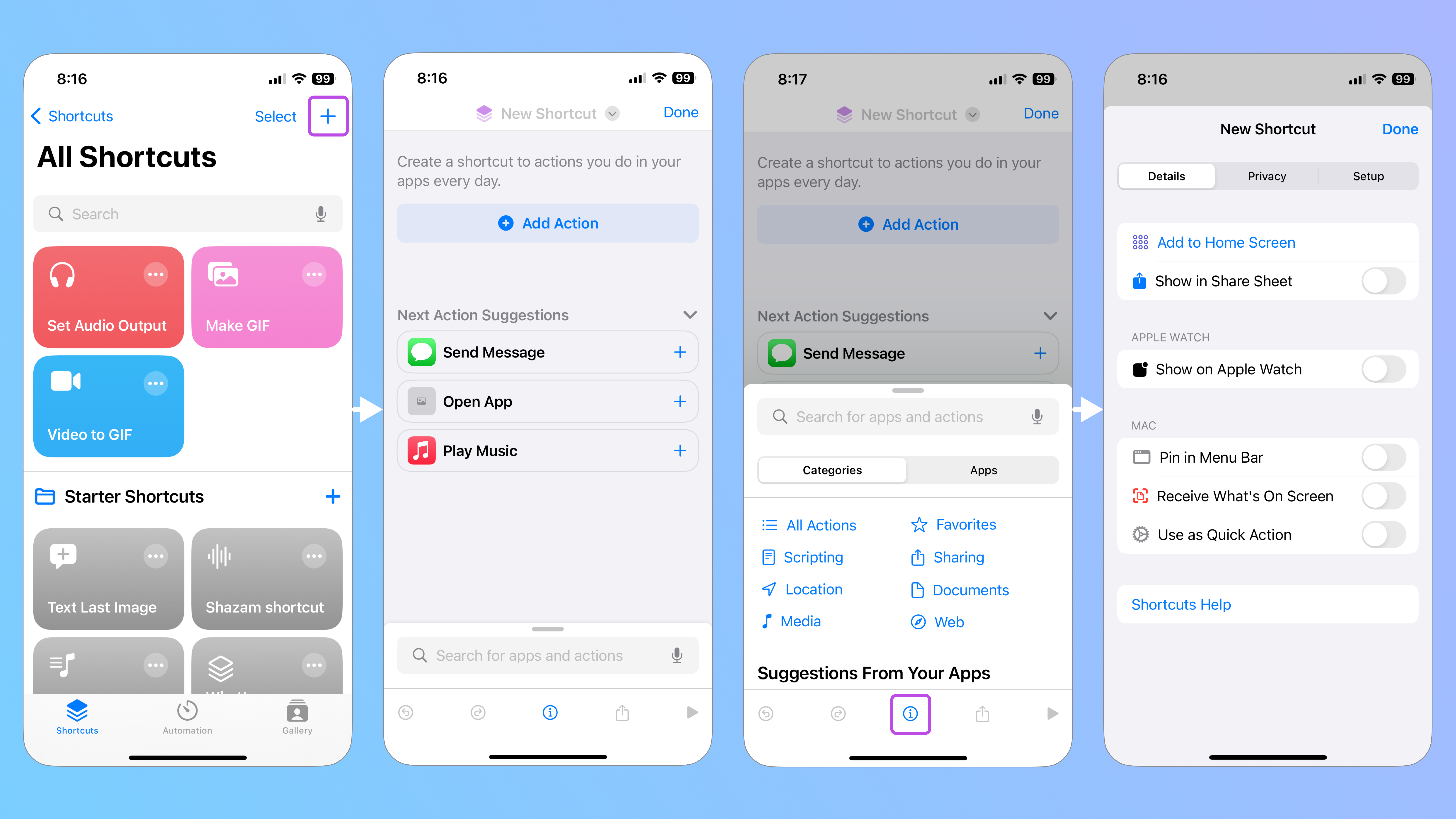
If you look closely, you’ll also notice that we inserted several modifiers to customize the look and behavior of each presentation. We used everything from Presentation Detents, Interactive Dismiss Disabled, Background Interaction, Drag Indicator to the Presentation Background modifier.
These modifiers may not mean much to you yet, but let’s pull back the layers of this Shortcuts app recreation, so you can learn how to build and customize modal presentations for your app.
Download This File
If you’d like to follow along with this tutorial, download this starter Judo file.
Full Screen Cover
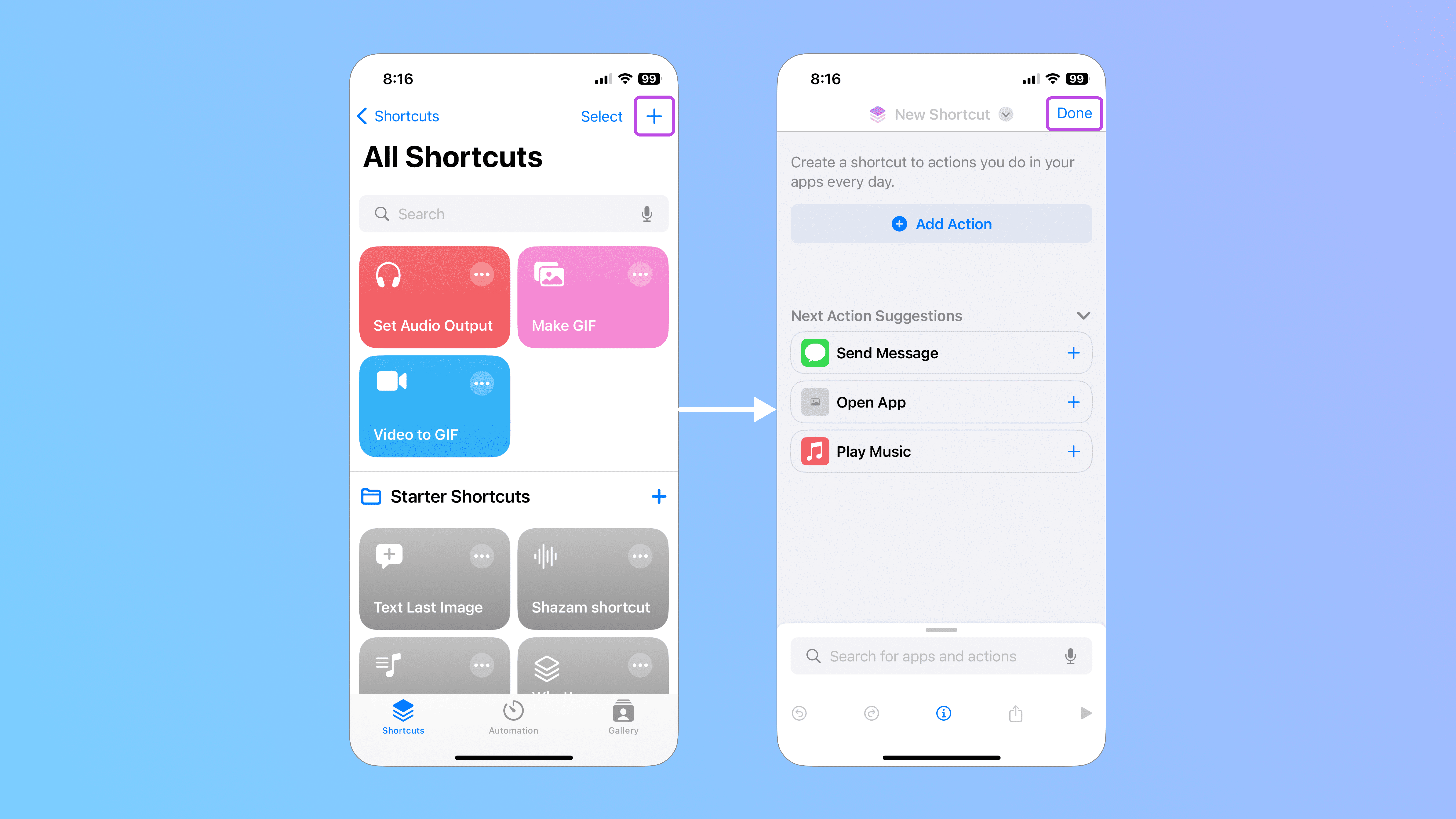
The Full Screen Cover modifier presents a modal layer that covers the entire screen. It prevents interaction with the parent screen and requires an explicit action to dismiss.
In the Shortcuts app, when a user clicks on the plus (+) icon in the Toolbar, they can create a new shortcut without completely navigating away from the screen thanks to the Full Screen Cover that appears. To dismiss the presentation, they can click on Done in the top-left corner.
To start, insert the Full Screen Cover modifier onto the screen that the presentation will appear on top of. In this case, it’s called “All Shortcuts”.
Presentation modals are typically applied to the layer that triggers the Full Screen Cover, so in this example, I’ve added it to the VStack called “Content” because it contains the plus icon Toolbar Item. used to reveal the presentation.
By default, the Full Screen Cover modifier consists of a Text layer. To activate the Full Screen Cover, you need to bind it to a Boolean property. When the value is True, the Full Screen Cover will be presented. False will keep it hidden.
You can create a property by clicking on the Is Presented parameter in the Inspector panel. Since I want the Full Screen Cover to only appear when a user clicks on the plus icon in the Toolbar, I’ll set the default value to False to keep it hidden.
Since the default state of the Full Screen Cover is hidden, we need to create an action that triggers its appearance. In this case, we want users to click on the plus icon in the Toolbar to make the presentation screen appear.
To activate the plus icon, add an action to the Actions section of the Toolbar Item modifier and set the Boolean value to True. This way, the Full Screen Cover will appear when a user clicks on the plus icon.
You can see this in action by clicking on the name of the screen component in the Layers panel and temporarily changing the default value from False to True in the Inspector panel.
Since you can’t visualize a presentation unless its Boolean value is set to True, it’s best practice to build the Full Screen Cover in a separate component and then insert an instance of it instead. Therefore, delete the Text layer and replace it with an instance of the presentation screen component.
By default, a Full Screen cover cannot be dismissed without an explicit dismissing action. Therefore, ensure that the Done button in the presentation component has a Dismiss action.
Send your file to your phone.
To see your Full Screen Cover in action, share the file to your mobile device and preview it in the Judo app.
<hr>
Before moving forward, let’s take a look at the Code Inspector to break down some of the SwiftUI code generated by Judo.
Earlier, we created the <code>presentNew</code> property to create a True and False state for the Full Screen Cover. You can see the <code>presentNew</code> variable with the type <code>Bool</code>, or Boolean, in the code above.
We had set the default of this variable to <code>false</code>, which you can find in the initializer <code>init(presentNew: Bool = false)</code>. The initializer sets the initial state of an instance.
The <code>ToolbarItem</code> contains a <code>"plus"</code> icon <code>Button</code> that sets the <code>presentNew</code> variable to <code>true</code>. This way, when a user clicks on it, the Full Screen Cover gets presented.
The <code>.fullScreenCover</code> modifier is controlled by the Boolean binding <code>$presentNew</code>.
<hr>
Sheet

The Sheet modifier presents a modal layer that adapts to cover the screen while leaving a narrow strip of the background visible, letting the user know that they can dismiss it by swiping down. A Sheet can appear in different sizes and there are a variety of modifiers that you can apply to customize the presentation.
When a user is creating a new shortcut in the Shortcuts app, a Sheet automatically appears at the bottom of the screen, allowing users to find apps and actions without completely navigating away from the screen. By default, Sheets can be dismissed by swiping down, but in this example, we applied a modifier that disabled this action.
Let’s start by inserting a Sheet.
Similar to the Full Screen Cover, you would typically apply the Sheet modifier to the layer that would trigger it to appear. In this example, the Sheet automatically appears and it can’t be dismissed, so you can apply it to a layer at a higher level in the hierarchy instead to ensure that it is presented as soon as the layer hierarchy is rendered.
By default, the Sheet modifier also consists of a Text layer. To activate the Sheet, you need to bind it to a Boolean property. When the value is True, the Sheet will be presented. False will keep it hidden.
You can create a property by clicking on the Is Presented parameter in the Inspector panel. Since I want the Sheet to only always be visible, I’ll set the default value to True.
Notice how the presentation with the Text layer automatically appears, covering the screen behind it.
Just like the Full Screen Cover, it’s best practice to build the Sheet in a separate component and then insert an instance of it instead. Therefore, delete the Text layer and replace it with an instance of the presentation screen component.
Now, let’s set the available sizes, or detents, that the Sheet can appear as.
1. Presentation Detents
A detent refers to the available sizes that a Sheet can appear as. The default size is Large, but you can change the size or provide more than one detent with the Presentation Detents modifier. Your app will display the presentation at the smallest detent first.
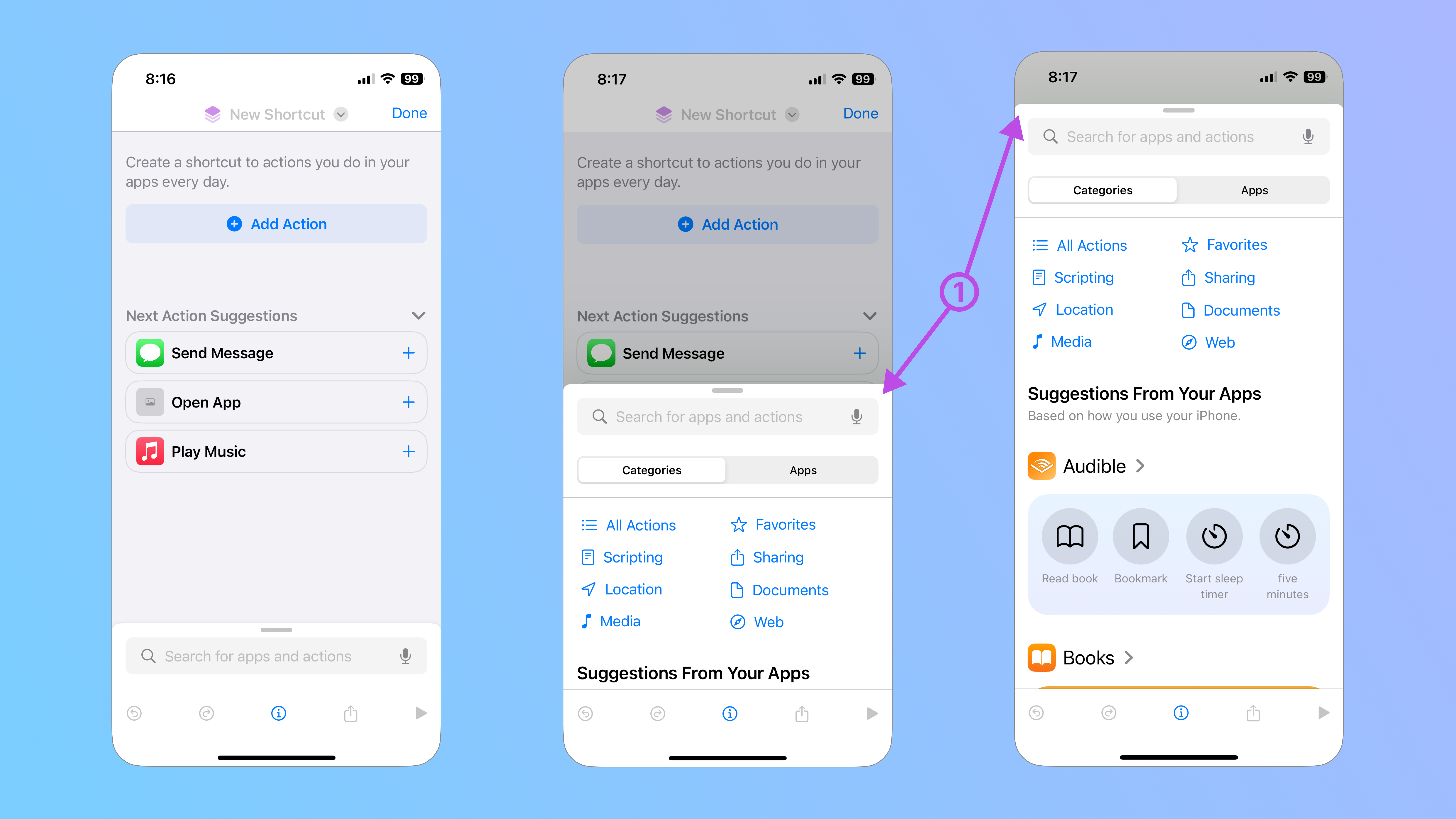
This Sheet in the Shortcuts app has 3 detents. To resize your sheet, apply the Presentation Detents modifier to the instance of your Sheet component on the parent screen. The Large detent will already be set, but you can add others by clicking on the plus (+) icon in the top-right corner of the Detents section.
To change the Detent from Large to another size, click on “Large” and choose from one of the following options:
- Medium - This detent takes up half of the screen
- Fraction - This detent takes up a specified fraction of the screen
- Fixed - This detent takes up a fixed amount of points on the screen
The Sheet that we’re recreating has a Medium detent as well as a Fraction detent set to 18%. Notice how each time we add a smaller detent, the Sheet changes to display the smallest size.
By default, a Sheet gets dismissed when a user swipes down, but since we want the Sheet to remain on the screen, we can disable that behavior with the Interactive Dismiss Disabled modifier.
2. Interactive Dismiss Disabled
The Interactive Dismiss Disabled modifier conditionally prevents the interactive dismissal of modal presentations.
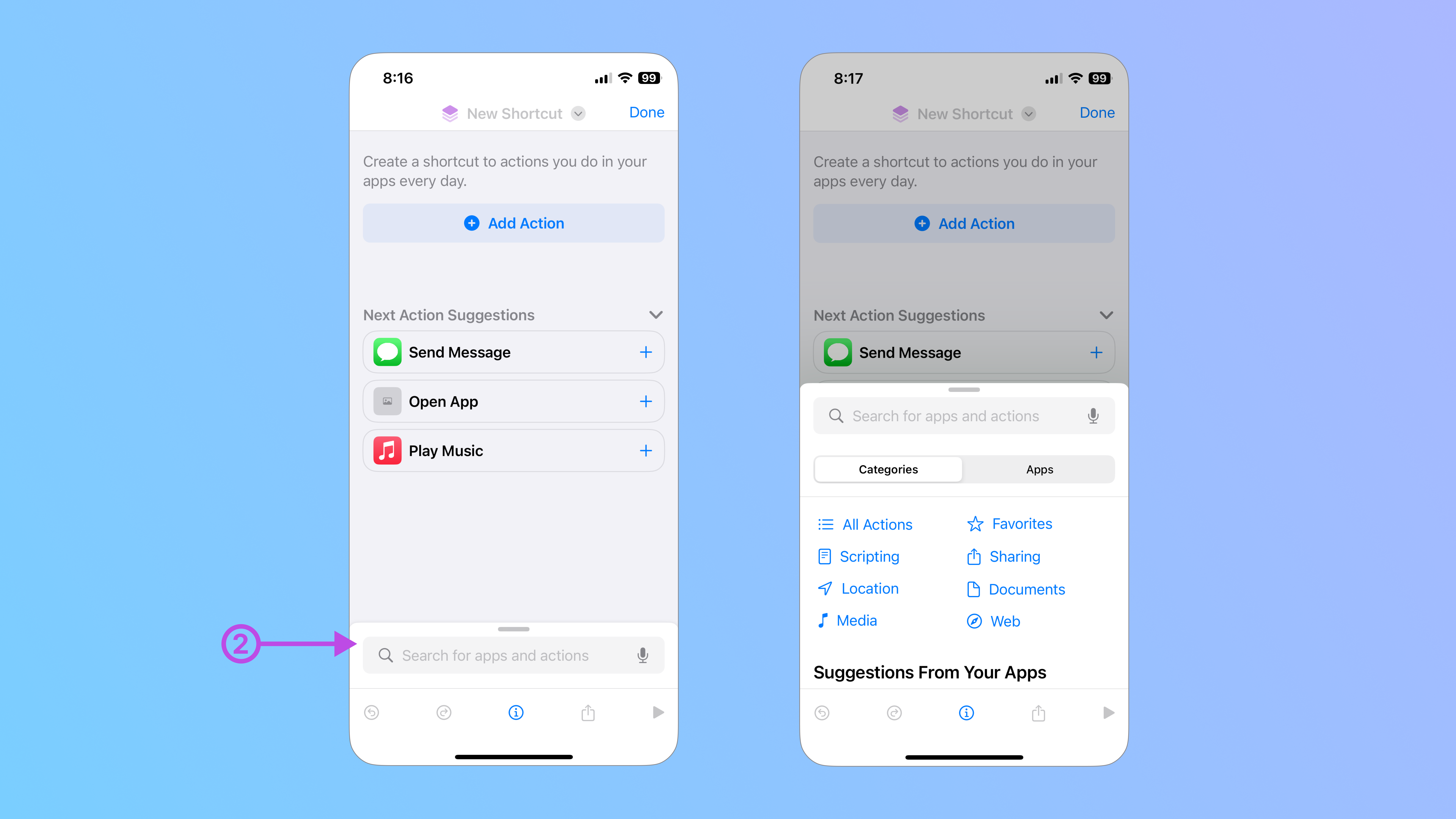
To prevent users from dismissing the Sheet by swiping down, apply the Interactive Dismiss Disabled modifier to instance of your Sheet component on the parent screen. By default, the Is Disabled parameter will be set to True, but you can also choose False or bind it to a property.
Preview your design on your phone.
Check to see if you applied the Interactive Dismiss Disabled modifier correctly by sending your file to your mobile device and previewing it in the Judo app.
Since this Sheet can’t be dismissed, we need to allow users to interact with the backing screen, so they can dismiss the Full Screen Cover to return to the navigational screen. You can enable interaction with the backing screen with the Background Interaction modifier.
3. Background Interaction
The Background Interaction modifier controls whether users can interact with the screen behind a presentation.
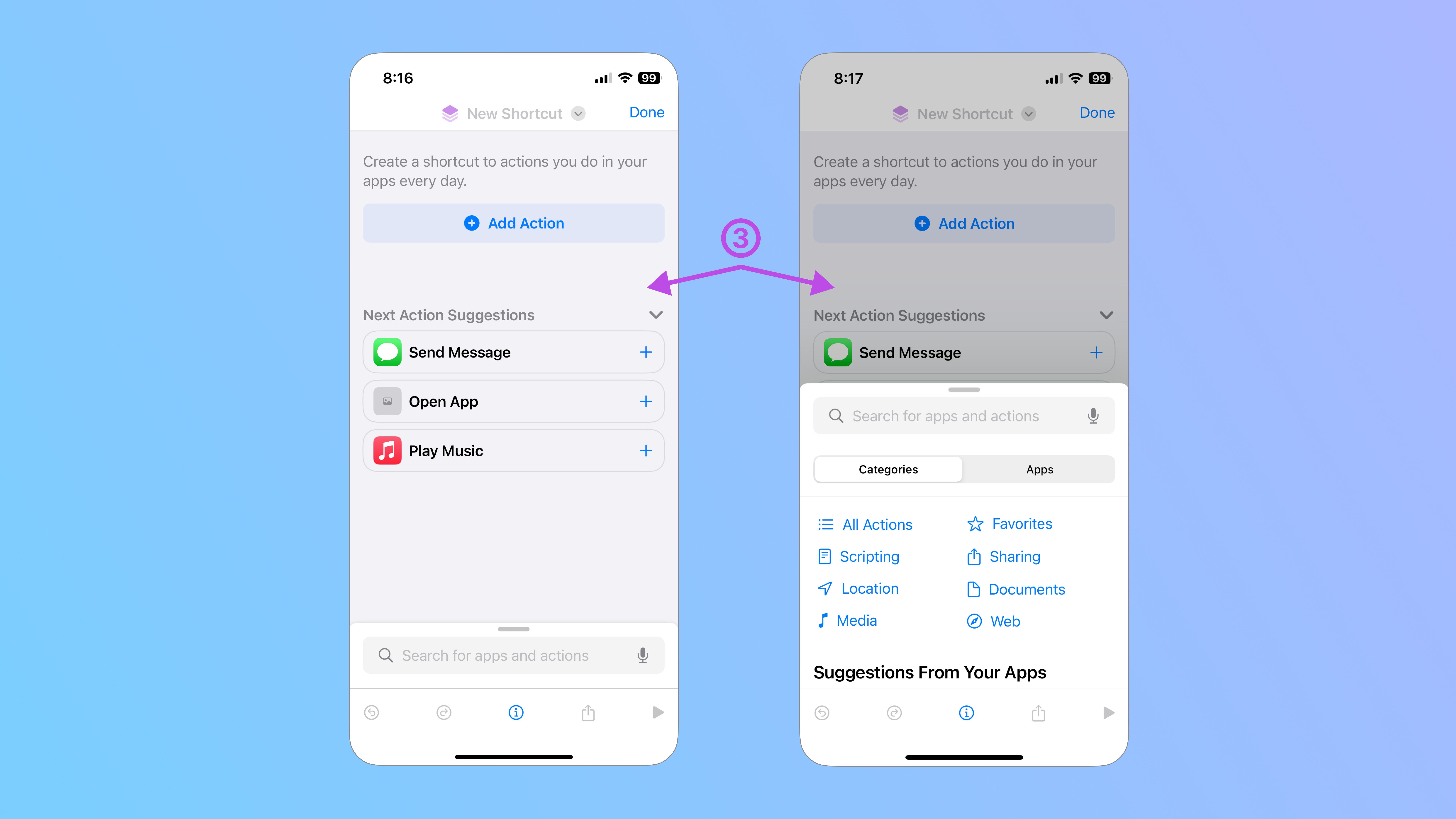
By default, the screen behind a Sheet that is presented is dimmed and disabled, so users can’t interact with the backing screen until they dismiss it. With the Background Interaction modifier, you can enable interaction with the background by indicating up until what point a user can interact with the backing screen:
- Large - Up until the Sheet covers the entire screen.
- Medium - Up until the Sheet extends more than the middle point of the screen.
- Fraction - Up until the Sheet extends more than the set fraction of the screen.
- Fixed - Up until the Sheet extends more than the set amount of points on the screen.
Apply the Background Interaction modifier to the instance of your Sheet component on the parent screen and set the Up Through parameter. In this example, I’ve set the Up Through parameter to 18%, so once a detent surpass that, the user will no longer be able to interact with the background as it becomes dimmed and disabled.
You can also configure the interaction with content on a modal presentation.
4. Content Interaction
By default, when a user swipes on a Scroll View in a resizable modal presentation, the presentation grows to the next detent. Therefore, a Scroll View embedded in the presentation only scrolls after it reaches its largest size. You can use the Content Interaction modifier to control which action takes precedence.
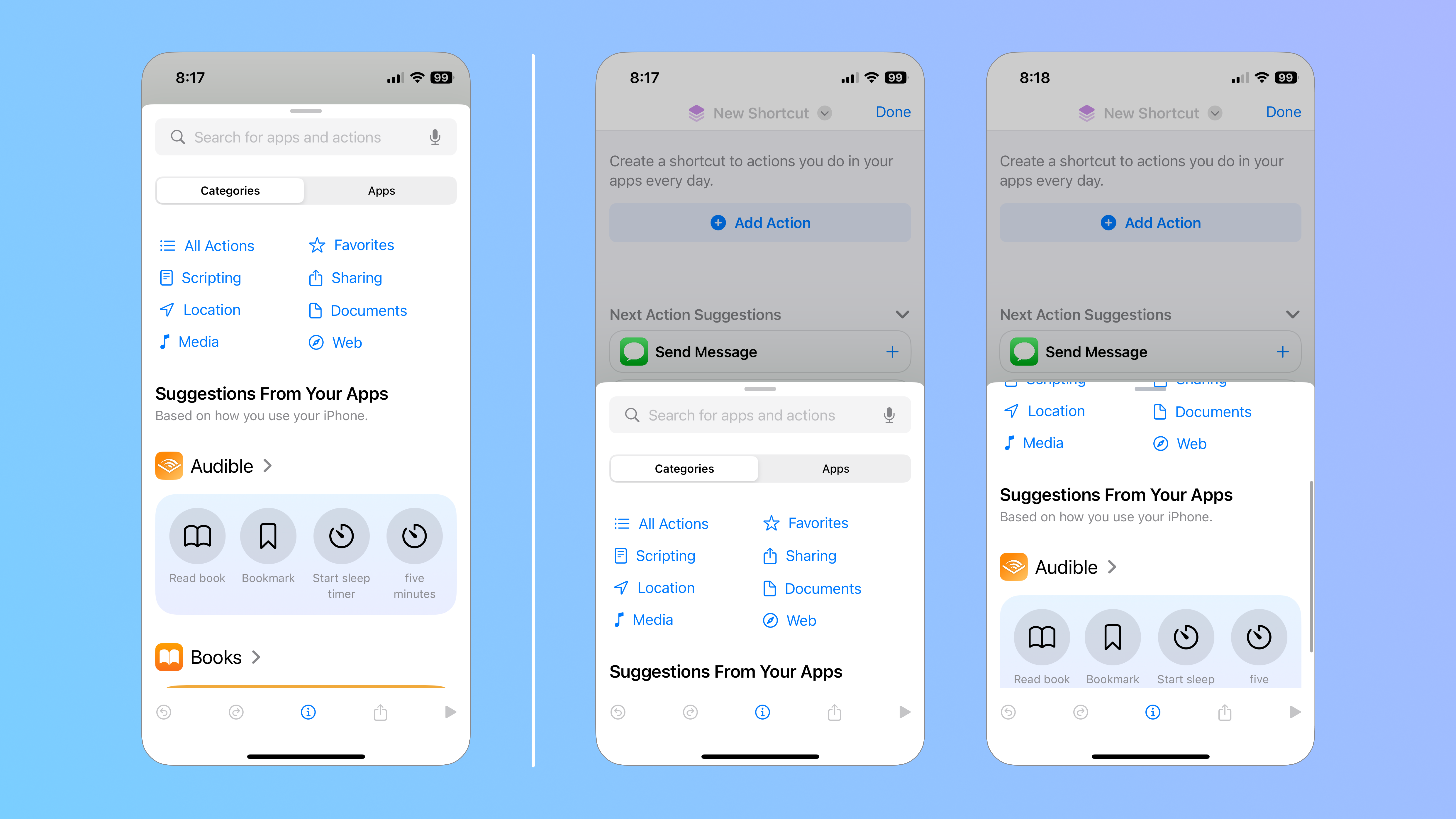
Although this Sheet in the Shortcuts app doesn’t use the Content Interaction modifier, here’s how you would apply it if you wanted a user to be able to scroll through a detent before it grows to the next one.
Select the instance of your Sheet component on the parent screen and insert the Content Interaction modifier. Make sure that the Interaction parameter is set to Scrolls. Choose the Resizable property if you want the presentation to grow to the next detent instead of scrolling first.
<div class="callout note">Note
Although the scroll interaction will take precedence, you can still resize the presentation using the Drag Indicator.</div>
<hr>
Before we move any further, let’s break down some of the SwiftUI code for this Sheet.
Earlier, we had added a <code>Dismiss</code> action to the <code>"Done"</code> button on the Add Shortcut Cover screen. The <code>@Environment(.dismiss)</code> custom environment key is used to handle the dismissal of the <code>Add_Shortcut_Cover</code> screen. This dismissal is triggered by the "Done" <code>Button</code>, which calls on the <code>envDismiss()</code> variable.
The <code>Shortcuts_Action_Sheet()</code> is bound it to the <code>sheetPresented</code> Boolean property with a default state of <code>true</code>, so it’s visible the moment a user visits the <code>Add_Shortcut_Cover</code> parent screen that its instance lives in.
As you can see, every modifier begins with a period followed by its name in camel case. Inside of the parentheses, you’ll find a set of arguments or parameters that we specified in the Judo canvas.
Take, for example, the <code>.presentationDetents</code> modifier. Inside the parentheses, we see exactly what we had selected: a <code>.large</code>, <code>.medium</code>, and <code>.fraction(0.18)</code> detent, with each parameter separated by a comma.
<hr>
Let’s take a look at another Sheet in the Shortcuts app. Here, a user can tap on the info icon to reveal additional settings that they can adjust as they create their new shortcut.
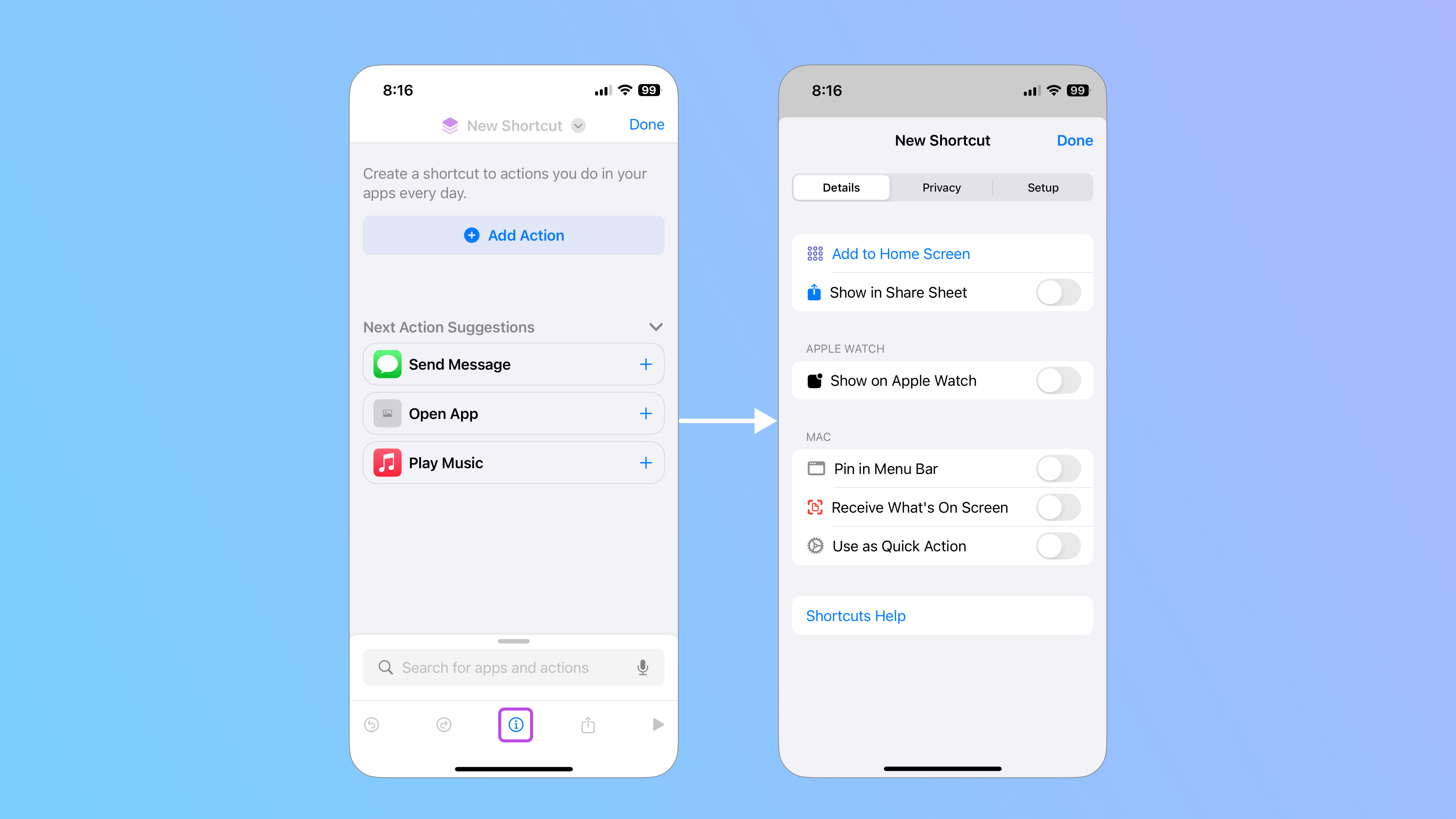
This Sheet contains a few other modifiers available in Judo, so let’s take a closer look at them.
5. Presentation Background
The Presentation Background modifier sets the presentation background color of an enclosing Sheet.
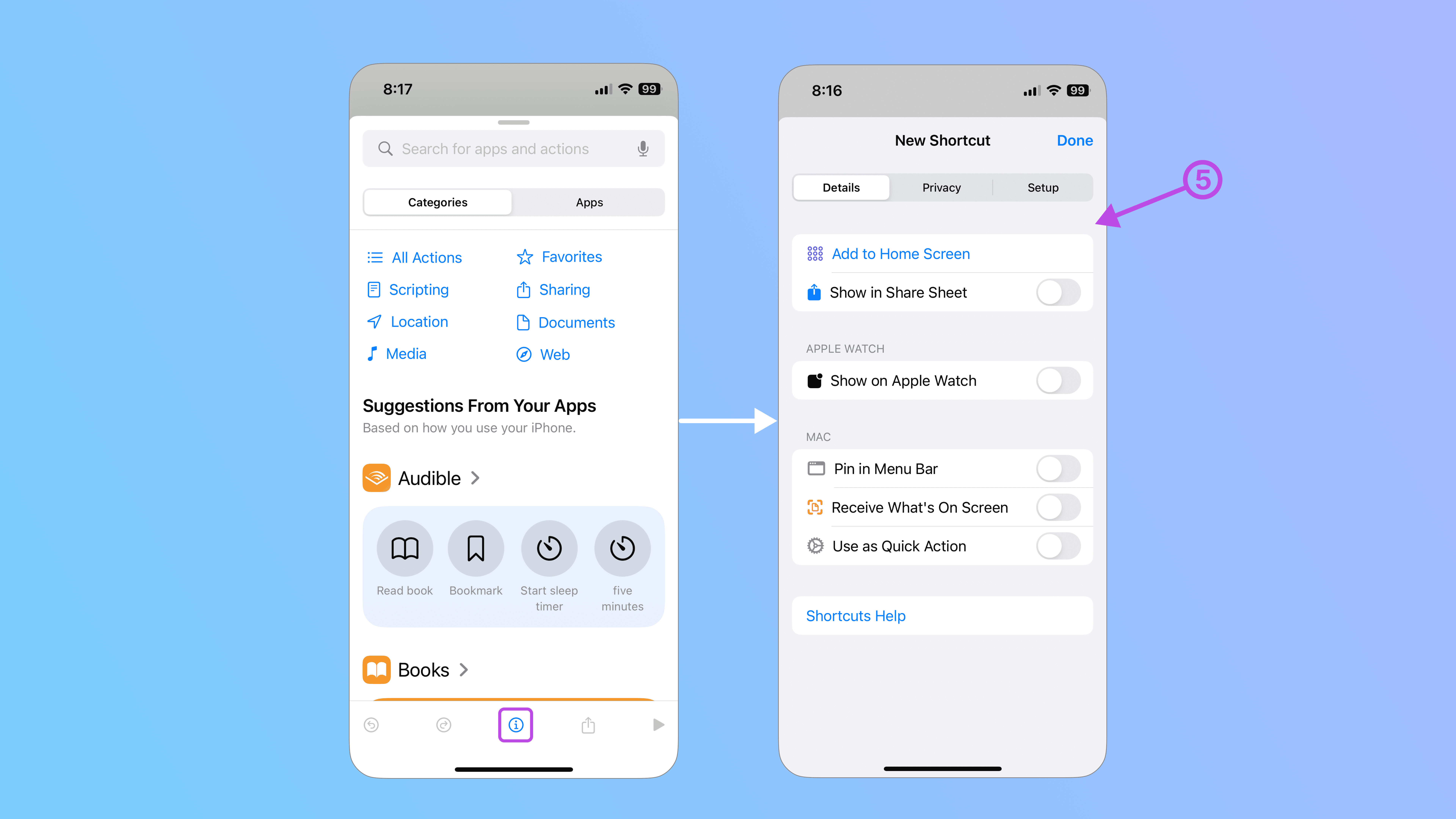
A Form container comes with a light gray background, so any layers outside of it don’t match. While we could apply a Background modifier to those layers, setting the background color of the presentation makes things much simpler.
Apply the Presentation Background modifier to the instance of your Sheet component on the parent screen and customize the Color parameter. To preview your Sheet’s background, temporarily change the default value of its binding property from False to True in the Inspector panel.
6. Drag Indicator
By default, a Sheet displays a Drag Indicator, or a small bar that appears at the top, to signal that users can either resize the sheet or swipe down to dismiss it. The Drag Indicator modifier sets the visibility of the Drag Indicator on top of the Sheet.
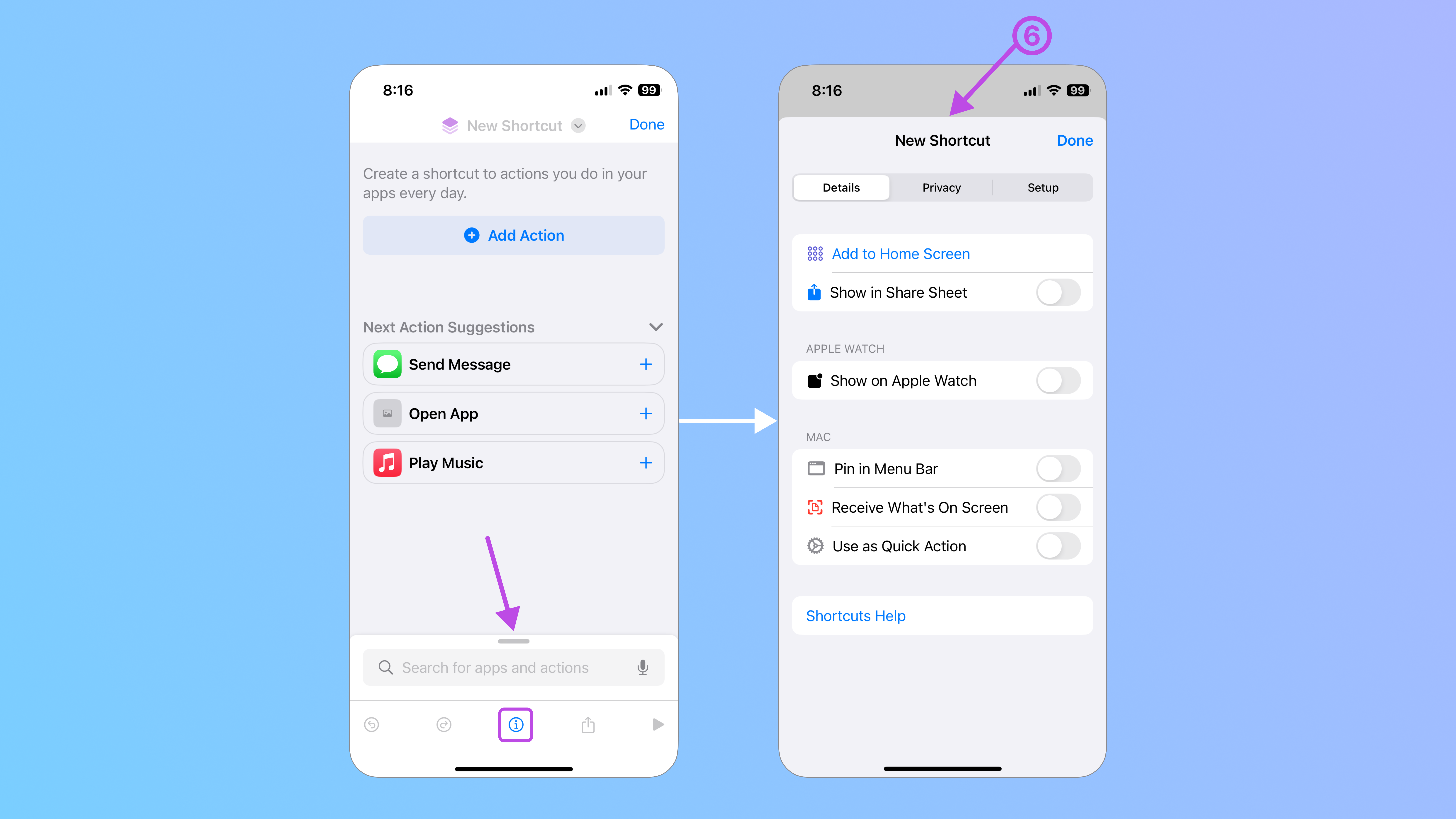
The first Sheet has a Drag Indicator, but it’s hidden in the second one. To hide a Drag Indicator, apply the Drag Indicator modifier to the instance of your Sheet component on the parent screen and set the Visibility parameter to Hidden.
7. Corner Radius
By default, modal presentations have a set corner radius (pictured in the middle), but you can customize the radius with the Corner Radius modifier to either remove it or set a different point size.
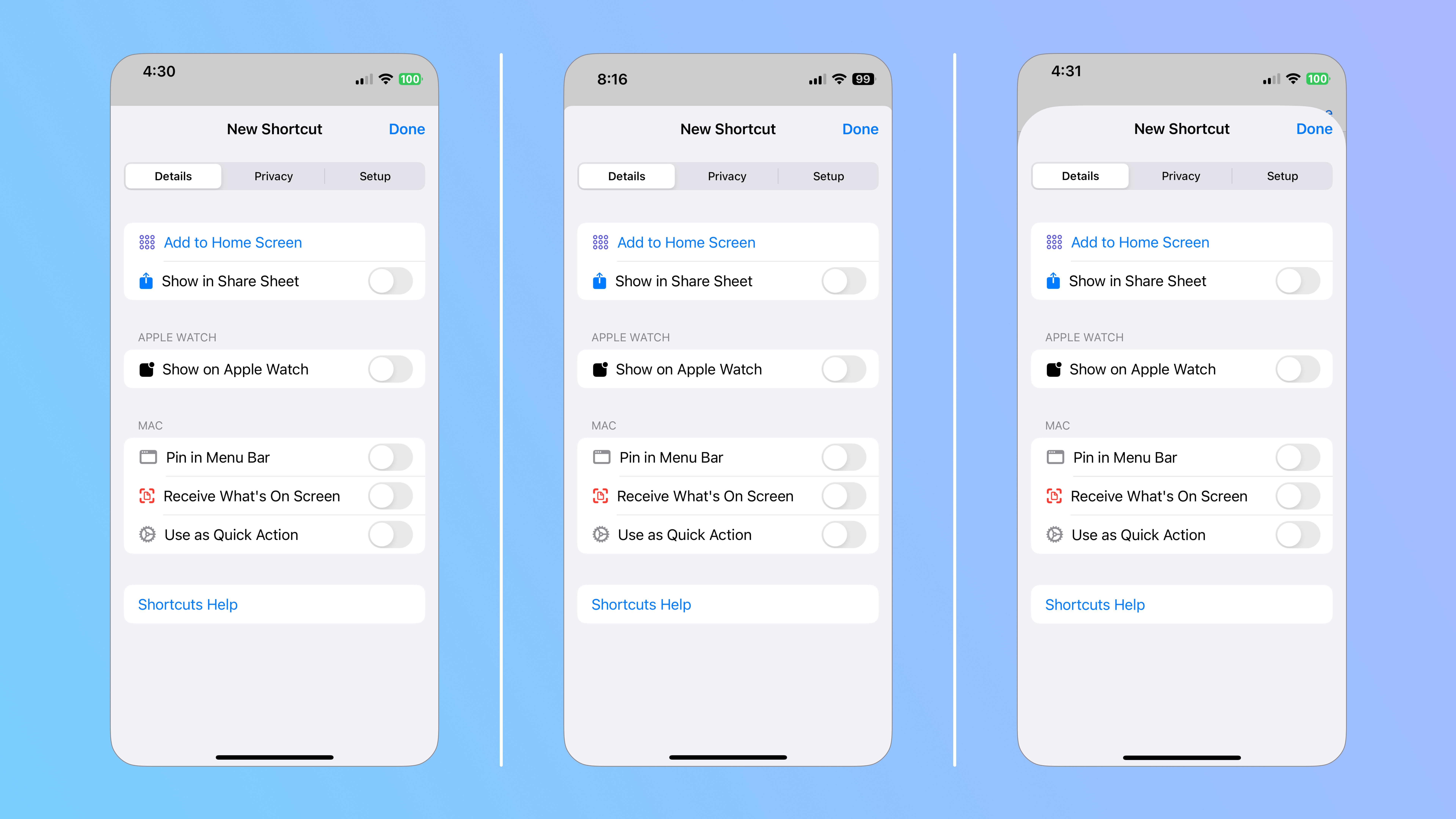
Although this Sheet in the Shortcuts app doesn’t use this modifier, here’s how you would apply it if you wanted to adjust the corner radius of a Sheet.
Select the instance of your Sheet component on the parent screen and insert the Corner Radius modifier. Use the Radius parameter to customize the radius of your corners. The larger the radius, the rounder your corners.
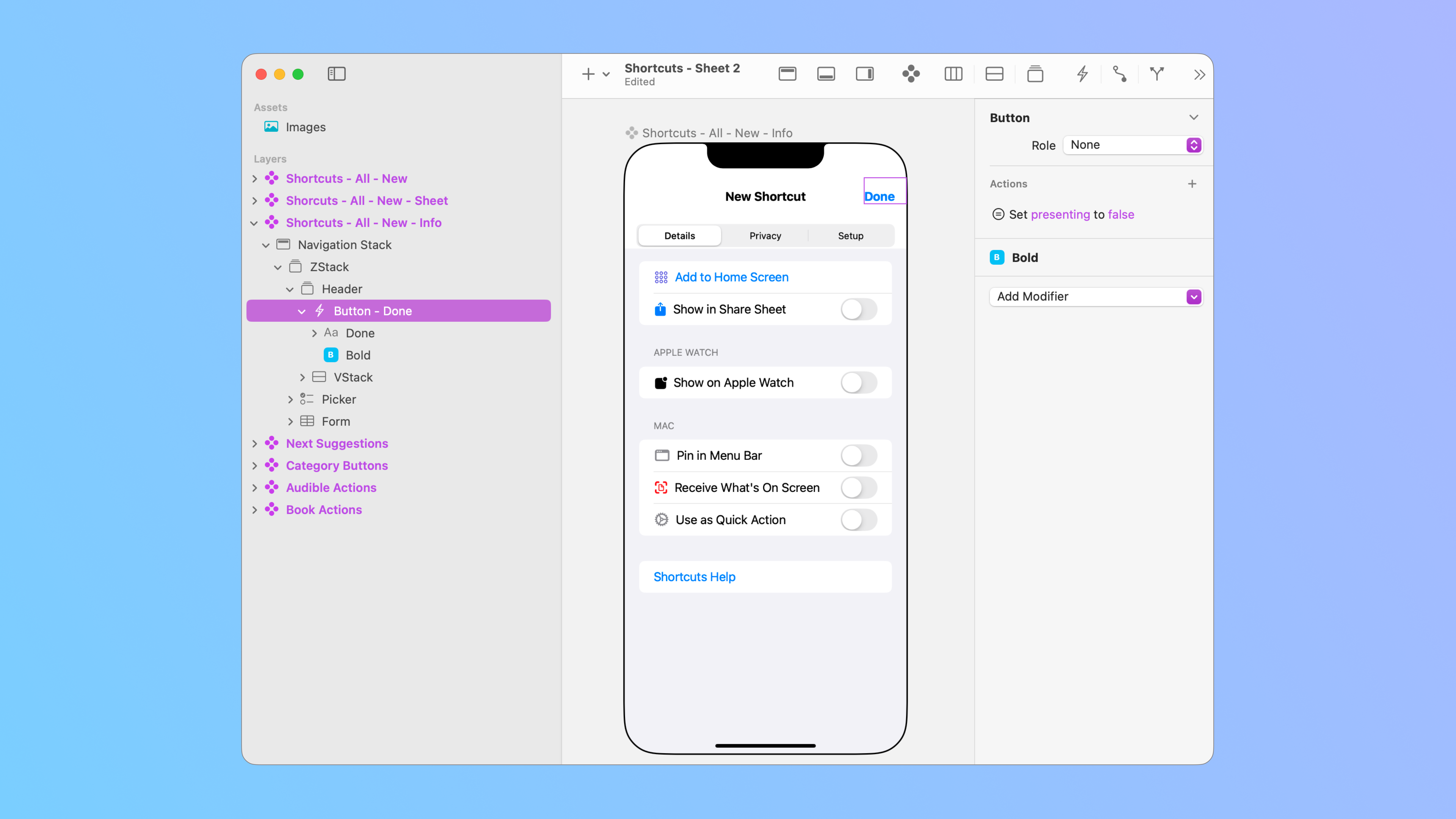
Now, although Sheets can be automatically dismissed by swiping them down, you can add other layers to make it more obvious how to dismiss the modal presentation. In this example, I’ve inserted a Button in the top-right corner of the Sheet and set an Action that, upon clicking, sets the presenting property, which is bound to the Sheet, to False. This way, a user can dismiss the Sheet by either swiping it down, or by clicking on “Done”.
That’s it for Modal Presentation! Don’t forget that you can preview your recreation of the Shortcuts app by sending it to your mobile device and opening it with the Judo mobile app.
Ask Our Community
If you have questions about the Judo editor, or developer questions about SDK integration, join the community and start a conversation!

