Components
Main Component
Components are elements that you can reuse across your designs to help create and manage consistency.

Overview
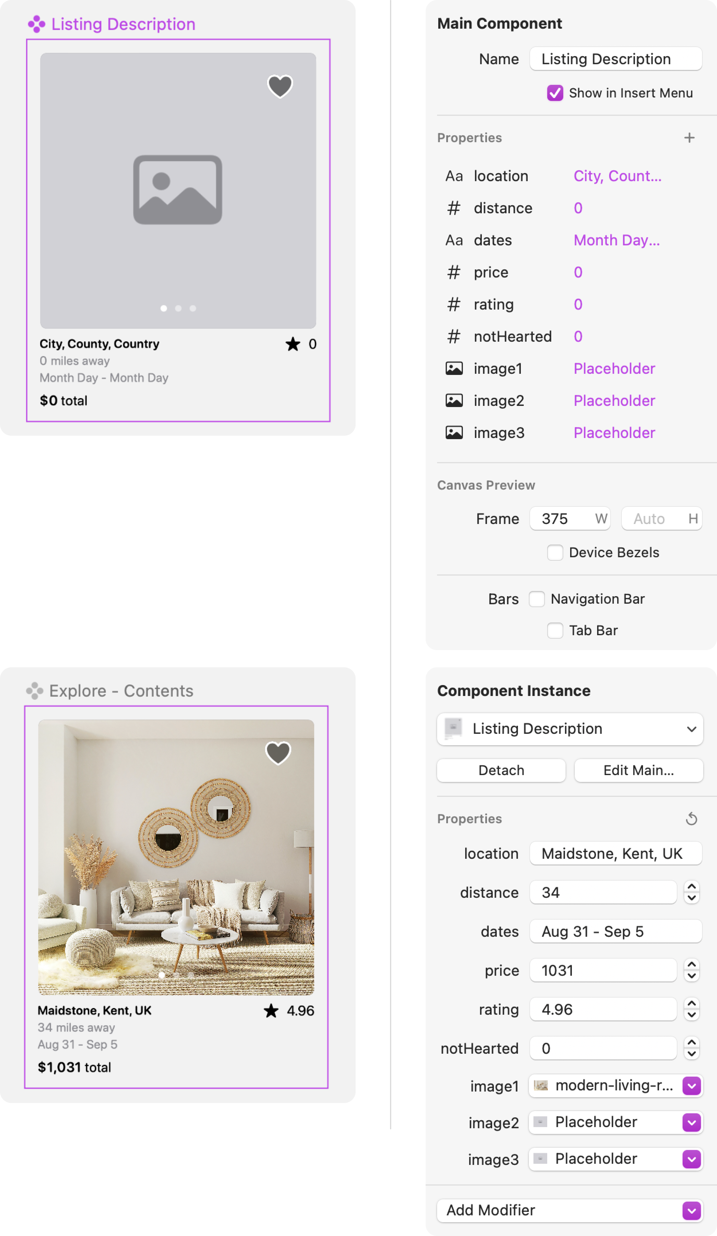
A main component defines the layout, style, and properties of the component. You can create a screen component or components from one or more layers that you've added to the canvas. Components are useful for a whole range of things like reusable screens, buttons, rows, cards and more.
Inserting a Screen Component
Insert a Screen Component from the Insert + menu to create a main component and rename it from the Layers or Inspector panel.

Creating Component from Layers
Create components from a selection of layers by selecting the layer(s) you want to include from the Layers panel. Then right-click on your selection, choose Create Component, and give your component a name.

Pro Tip
With the layers selected, you can use the keyboard shortcut ⌥⌘K to create a component.
Component Properties
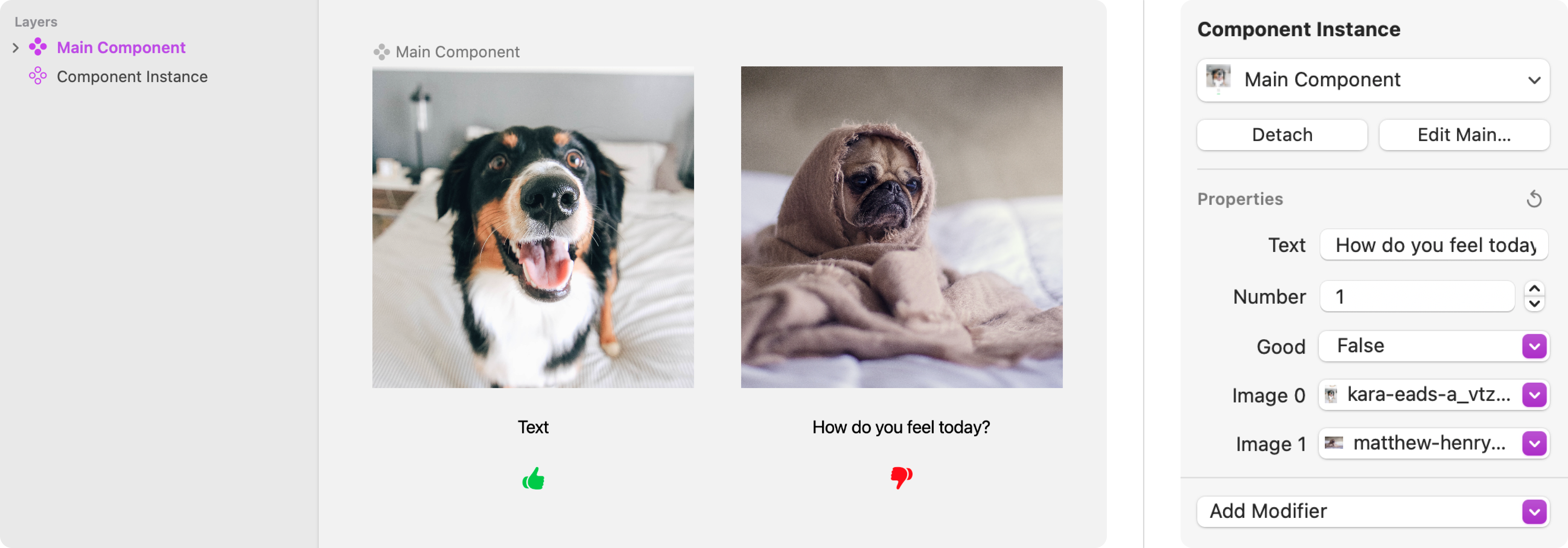
Component Properties provide a way to customize the instances of main components. You can define which parts of a component can be customized by attaching layers to different kinds of properties. This allows instances to be customized in different ways:
The properties defined on a main component are presented as a set of controls in the Inspector panel when an instance of a component is selected. You can use these controls to understand what is editable to customize the instance.
Property Types
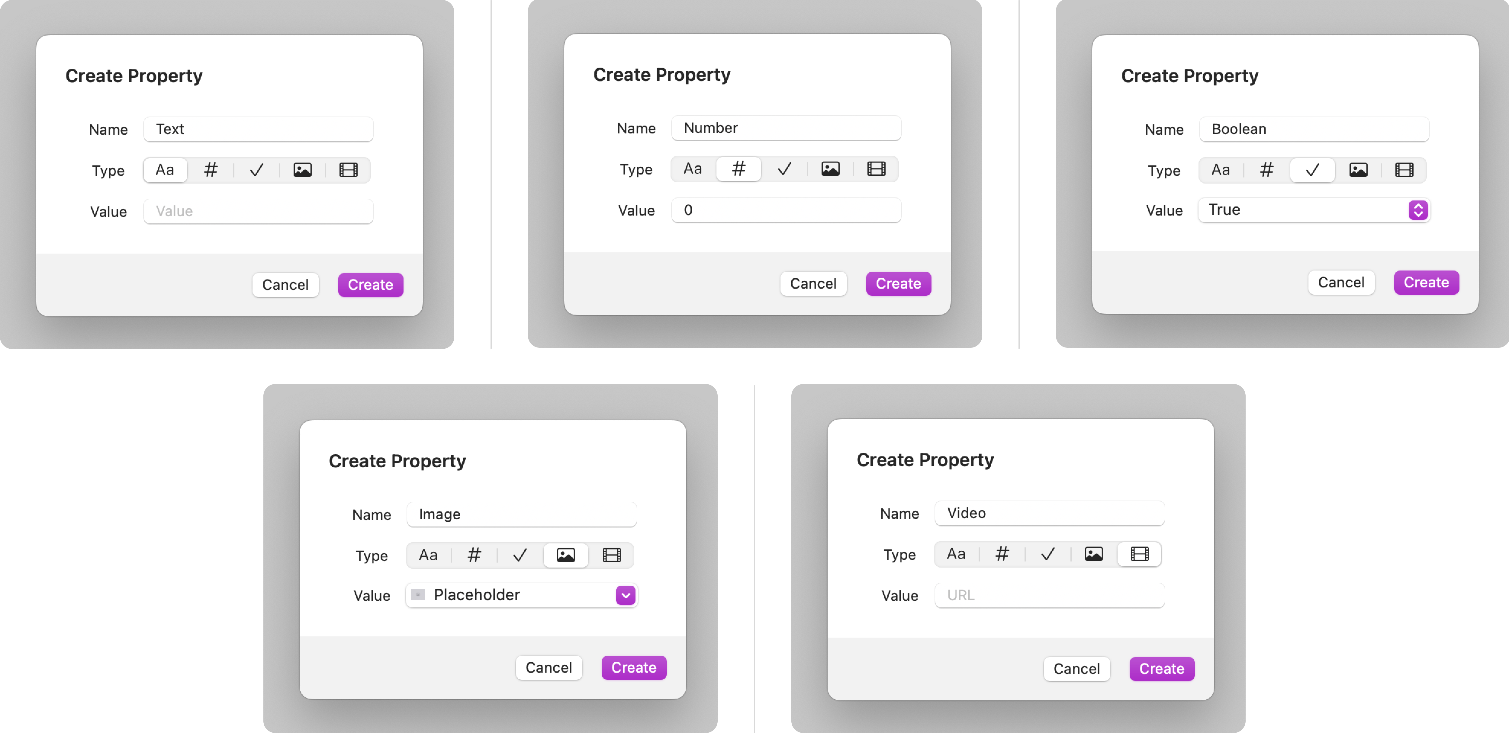
Component properties come in different types:
- Text - Makes text content in Text layers and modifier labels customizable.
- Number - Used in conjunction with the Conditional layer to hide or show different layers within the component based on numeric comparisons such as Equals or Does Not Equal or Is Greater Than or Less Than. Can also be used in Text layers and modifier labels where it will be displayed as a formatted number.
- Boolean - Used in conjunction with the Conditional layer to hide or show different layers within the component depending on whether the property is True or False.
- Image - Attaches the selected image in an Image layer to an Image property to make the image asset customizable.
- Video - Attaches the selected video in a Video Player layer to a Video property to make the video asset customizable.
How to Create & Edit Component Properties
<span style="color: #06013a;">Create a Component Property</span>
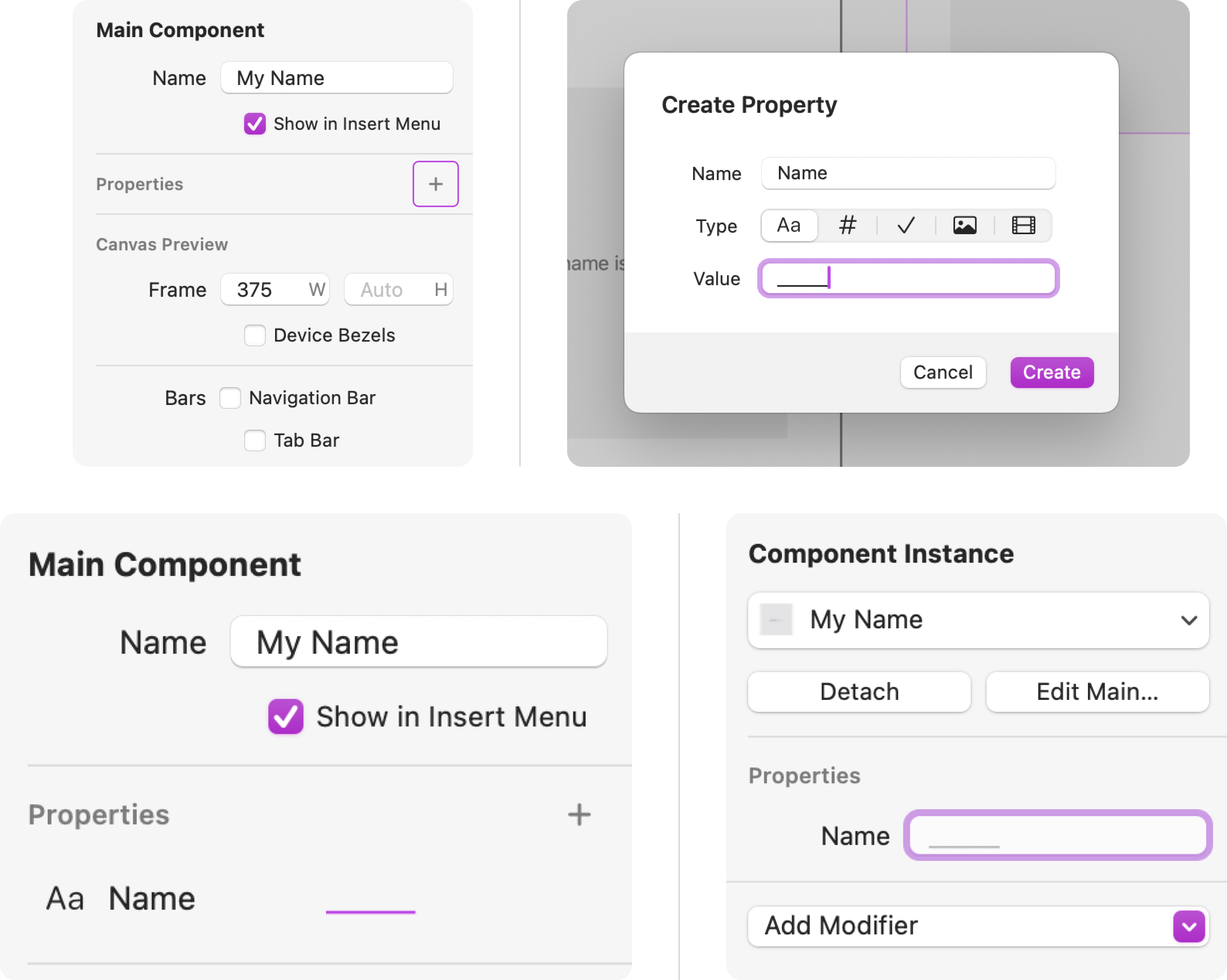
With the Main Component selected in the Layers panel, you can create a new property by clicking on the plus (+) icon in the Properties section of the Inspector panel.
Choose the Type and then enter a Name for your property and a Value. This value will be used by default. Instances of the component can be customized by changing the value to something else.
<span style="color: #06013a;">Edit a Component Property</span>
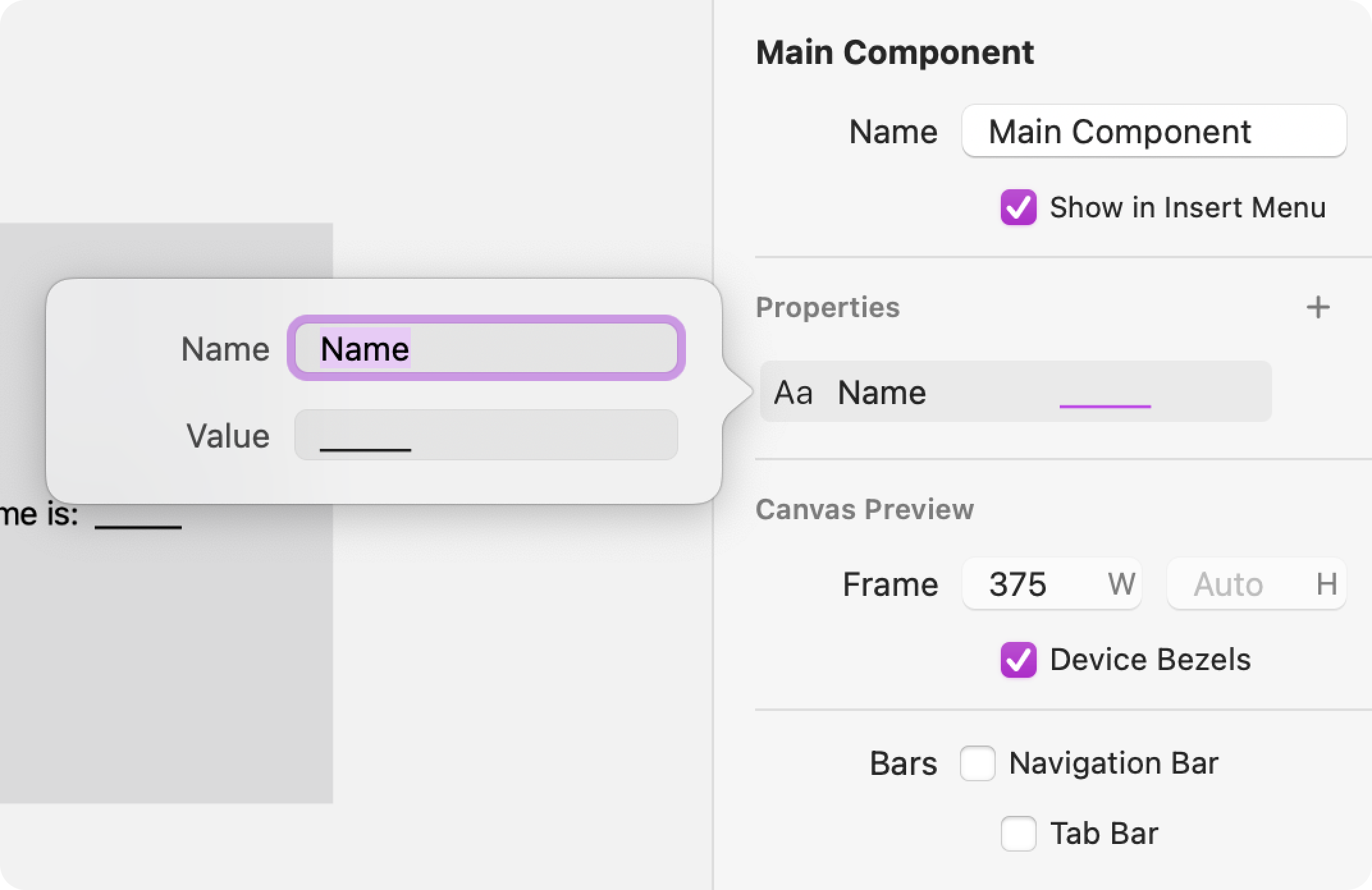
With the Main Component selected in the Layers panel, click on the Property name in the Inspector panel to adjust the Name or Value.
<span style="color: #06013a;">Delete a Component Property</span>
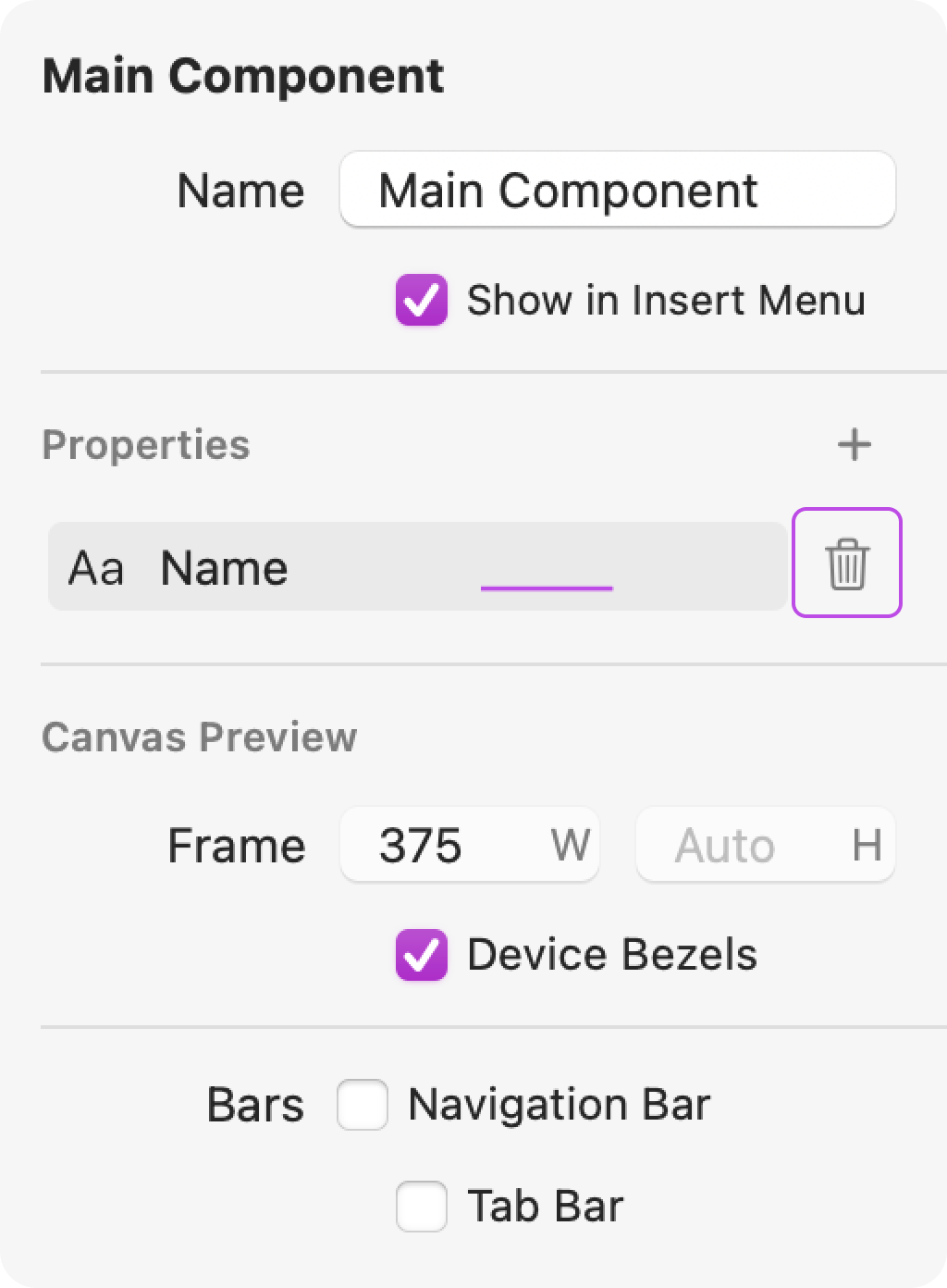
With the Main Component selected in the Layers panel, hover over the property and click on the trash can icon that appears in the Inspector panel to delete a component property.
How to Attach Component Properties
Each of the five types of properties—Text, Number, Boolean, Image and Video—can be attached to different types of layer and modifier values.
<span style="color: #06013a;">Attaching a Text Value</span>
Certain layers and modifiers have text values that can be attached to component properties, such as the contents of a Text layer or the title of a Navigation Title modifier. Text values only accept Text or Number properties.
To attach a text value to a component property, select the applicable layer from the Layers panel, hover over the text field in the Inspector panel, click the Property Attachment Ring, and select one of the properties. If a suitable property doesn't already exist, you can create the property directly from the Property Attachment Ring.

<div class="callout note">Note
If you don't see the Property Attachment Ring when you hover over a text field, make sure the layer you have selected is part of a component.</div>
<span style="color: #06013a;">Attaching a Conditional Value</span>
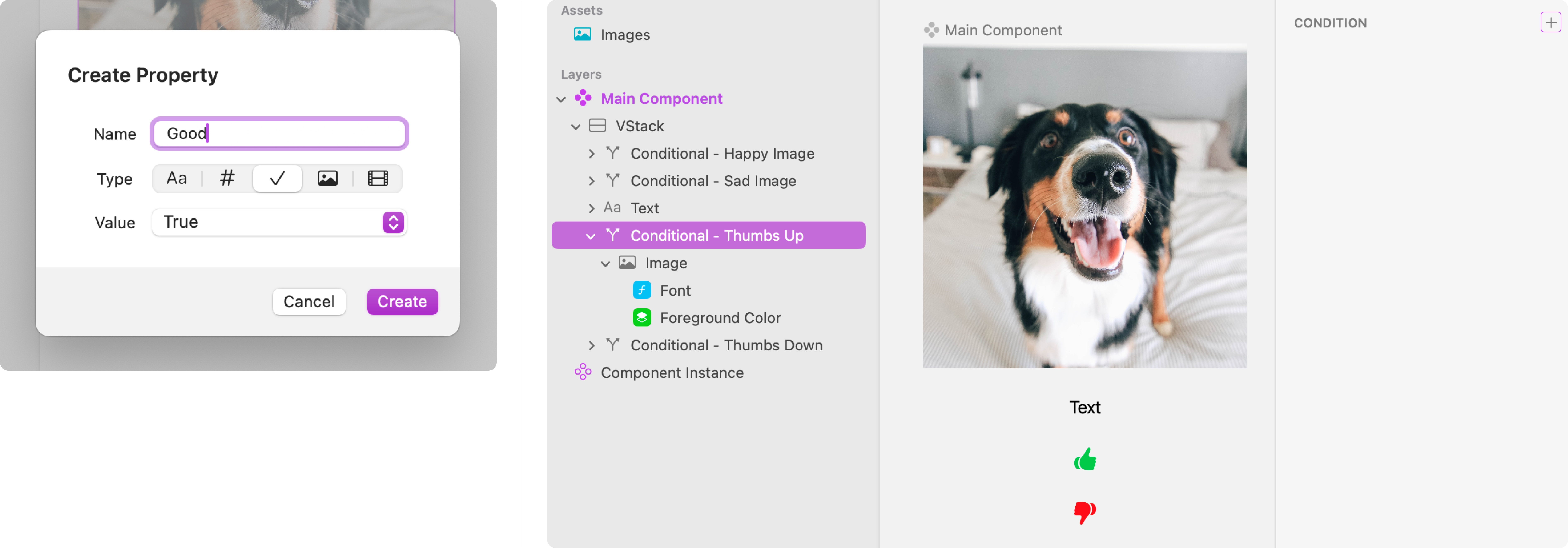
Number and Boolean component properties are often attached to Conditional layers to hide or show different layers within the component, depending on the Condition of the property. You can choose from 8 Conditions: Equals, Does Not Equal, Is Greater Than, Is Less Than, Is Set, Is Not Set, Is True, Is False.
To attach a Boolean property to a Conditional layer, select the layer from the Layers panel and from the Inspector panel, click the + icon to add a Condition, choose a Boolean property from the Key Path section, and select the Is True or Is False Condition from the list.

<span style="color: #06013a;">Attaching an Image Value</span>
Image layers have image values that can be attached to the Image component property. To attach an image value to a component property, select the applicable layer from the Layers panel, click on the Image drop-down in the Inspector panel, hover over Properties, and select one of the properties. If a suitable property doesn't already exist, you can create the property directly from the Properties section in the Image drop-down.

<span style="color: #06013a;">Attaching a Video Value</span>
Video Player layers have video values that can be attached to the Video component property. To attach a video value to a component property, select the applicable layer from the Layers panel, click on Choose… in the Video section, and select one of the properties. If a suitable property doesn't already exist, you can create the property directly from the Video section drop-down.

Videos
Ask Our Community
If you have questions about the Judo editor, or developer questions about SDK integration, join the community and start a conversation!


