Controls
Button
A Button is a control that initiates an action.

Overview
You can create a Button by providing an Action and a Label. The Action is a property that does something when a user clicks or taps the button. The Label can be any kind of layer that describes the Button’s action—for example, by showing text, an icon, or both.

Inserting a Button
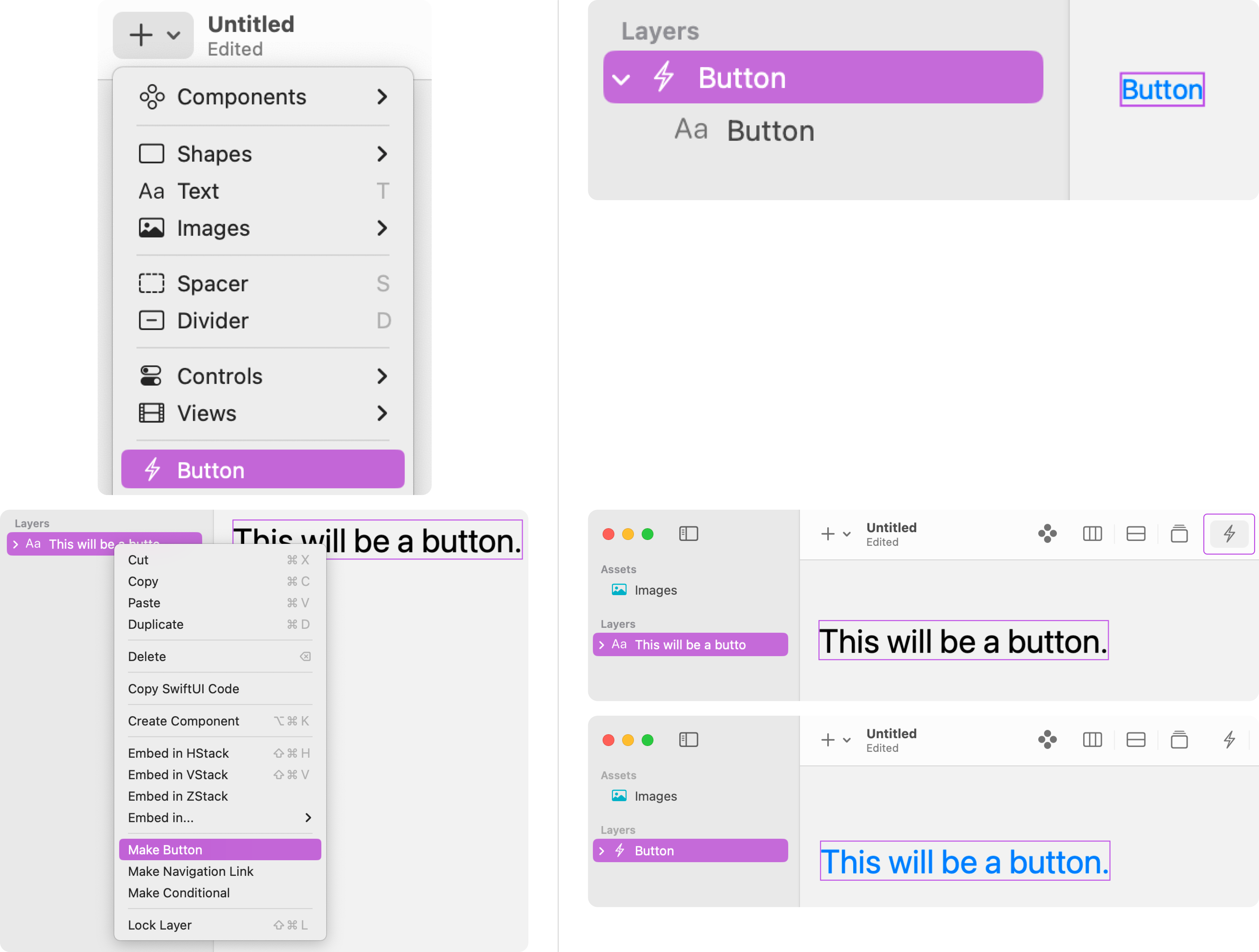
You can create a Button by adding one from the Insert + menu or by turning a layer into a Button. With the layer(s) selected, either click on the Button icon in the toolbar or right-click and choose Make Button.

Editing the Label
By default, a Button label is a Text layer with the Borderless button style (the text color is blue). You can adjust or replace the Text layer from the Layers panel.
Buttons have an inherit HStack, so if your Button Label consists of multiple layers, they will automatically arrange themselves horizontally.

To customize a Button’s appearance, apply the Button Style modifier to select one of the standard button styles available.
<div class="callout note">Note
Avoid labels that only use images or exclusively visual components without an Accessibility Label.</div>
Choosing an Action
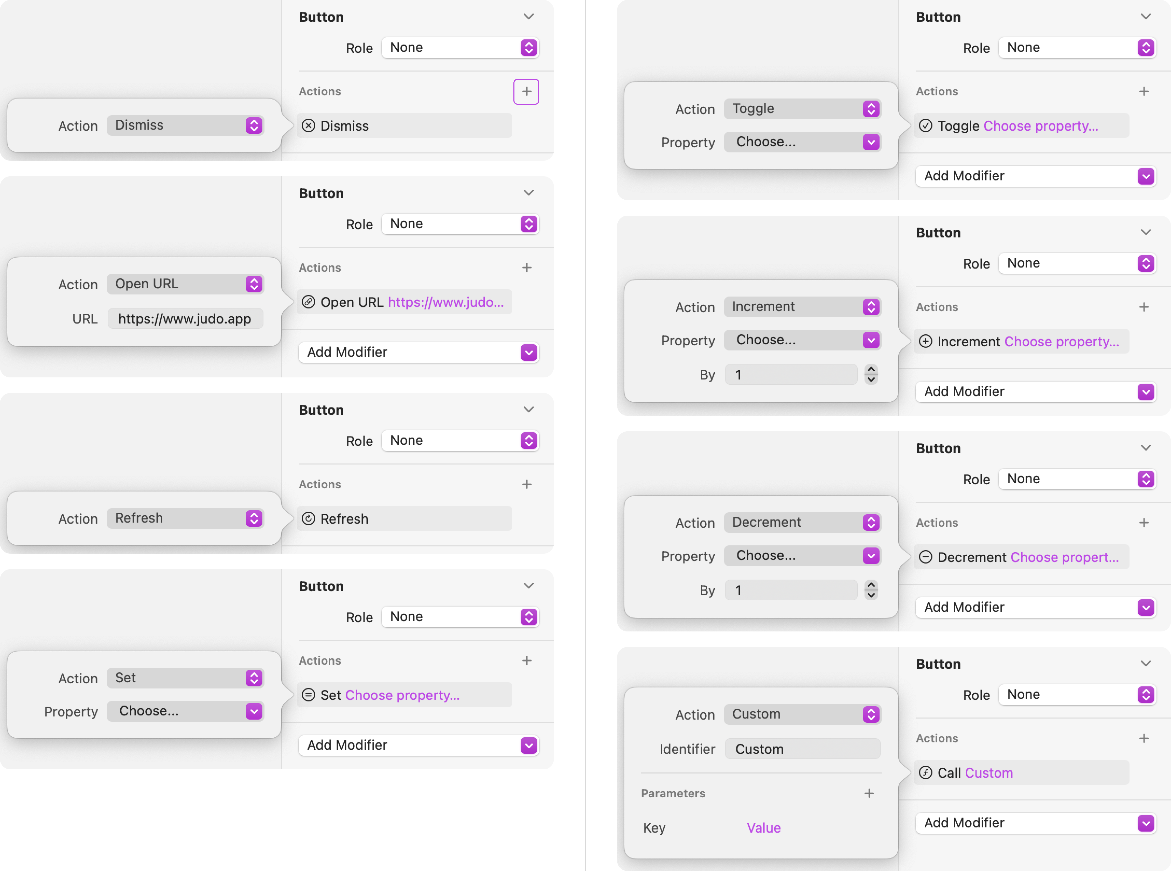
From the Inspector panel, click on the plus (+) icon in the Actions section and choose from the following Action properties:
- Dismiss - Dismiss a modal presentation, like a Sheet or a popover, or pop the current layer from a Navigation Stack.
- Open URL - Open a specific URL.
- Refresh - Initiate a refresh operation nested within a Data Source.
- Set - Set a component property to a specific value.
- Toggle - Toggle a Boolean property between True and False.
- Increment - Increment a Number property by a specific amount.
- Decrement - Decrement a Number property by a specific amount.
- Custom - Custom actions are used with the Judo SDK in an Xcode project to run custom code when the Button is tapped.

<div class="callout note">Note
To delete an Action, hover over it in the Inspector panel and click on the trash can icon when it appears.</div>
Assigning a Role
You can optionally give the Button a Role that characterizes the Button’s purpose. If you don’t specify a Role for a Button, the system applies an appropriate default appearance.
There are 3 roles that you can choose from:
- None
- Cancel - Cancel the current operation
- Destructive - Deletion action
The system uses the Button’s Role to style the Button appropriately in every context. For example, the Destructive Button appears with a red foreground color.

Adding Buttons to Containers
Use Buttons for any user interface element that initiates an action. Buttons automatically adapt their visual style to match the expected style within these different containers and contexts.
For example, you can add a Button to a Form’s content to initiate an action when selected by the user. Notice how the Button adapts its visual style to match the Form’s style.

Videos
Ask Our Community
If you have questions about the Judo editor, or developer questions about SDK integration, join the community and start a conversation!


