Navigation
Toolbar Item Modifier
The Toolbar Item modifier creates a Toolbar item with a specified placement and content.

Overview
Customize your Toolbar by inserting an item with the Toolbar Item modifier. To use it, apply the Toolbar Item modifier to a child in your Navigation Stack and customize the Placement, Title or Icon, and, if applicable, the Actions.
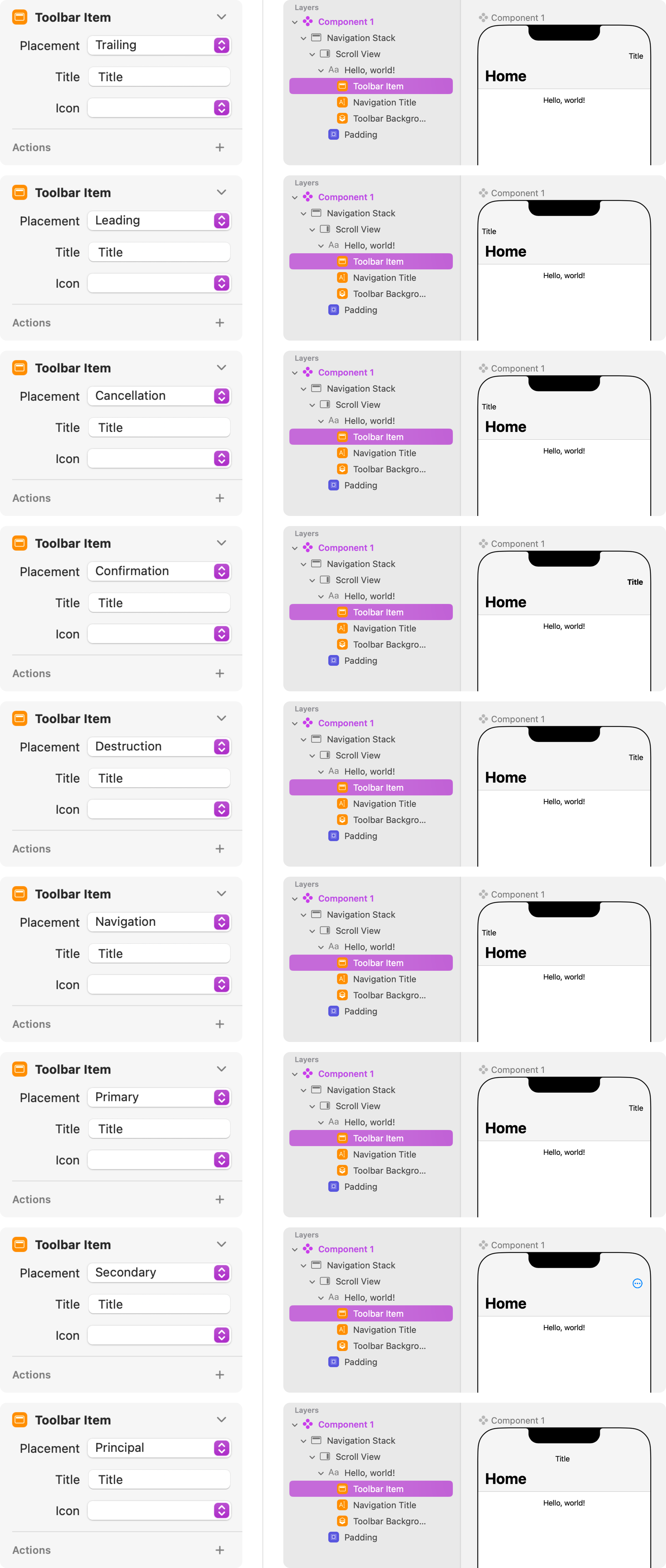
By default, the Toolbar item will be placed along the Trailing edge, but there are 8 other placements that you can choose from: Leading, Cancellation, Confirmation, Destruction, Navigation, Primary, Secondary, and Principal.
You can either add a Title or an Icon, but note that the Secondary placement comes with its own icon that will override any Title or Icon customizations that you set in the parameters.
<div class="callout note">Note
You can insert the Toolbar Item modifier more than one time to populate your toolbar with several Toolbar items.</div>

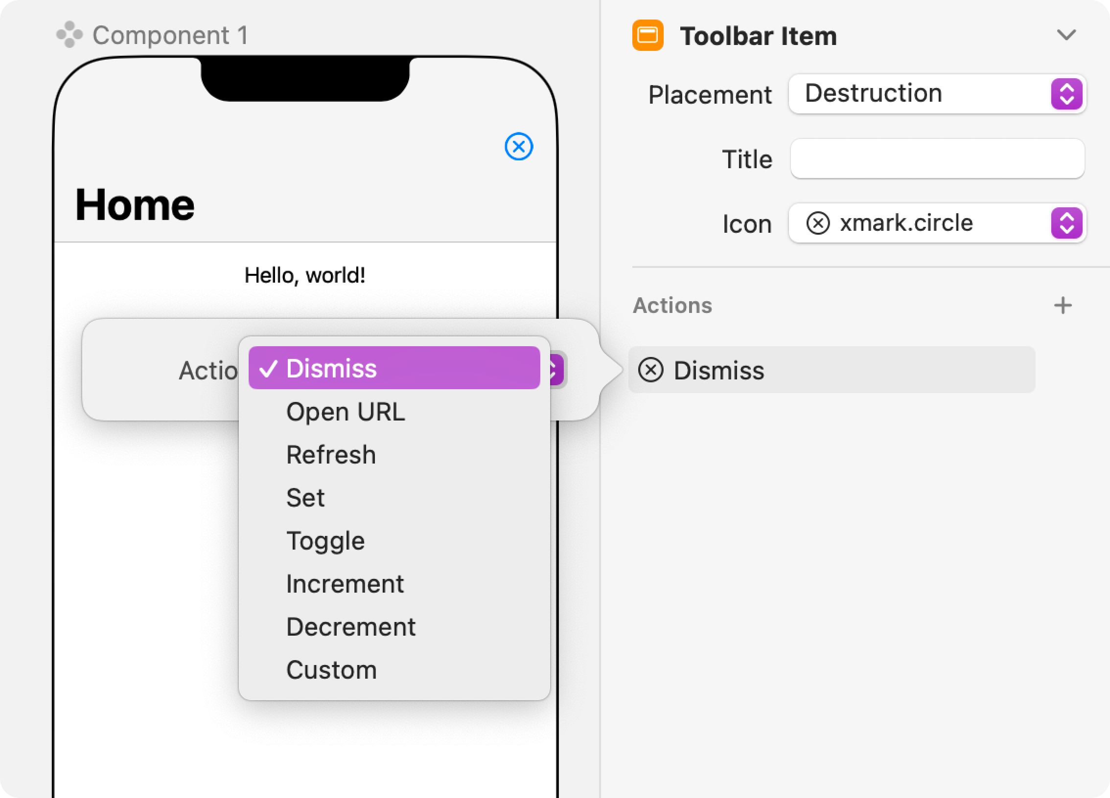
From the Inspector panel, you can also click on the plus (+) icon in the Actions section to choose from the following Action properties:
- Dismiss - Dismiss a modal presentation, like a Sheet or a popover, or pop the current layer from a Navigation Stack.
- Open URL - Open a specific URL.
- Refresh - Initiate a refresh operation nested within a Data Source.
- Set - Set a component property to a specific value.
- Toggle - Toggle a Boolean property between True and False.
- Increment - Increment a Number property by a specific amount.
- Decrement - Decrement a Number property by a specific amount.
- Custom - Custom actions are used with the Judo SDK in an Xcode project to run custom code.

Videos
Ask Our Community
If you have questions about the Judo editor, or developer questions about SDK integration, join the community and start a conversation!


