Fundamentals
How to Navigate Between Screens
To demonstrate how to create a navigation hierarchy and how to customize the Navigation Bar for each screen, let’s recreate parts of Apple’s Contacts app.

Navigation is an essential aspect of app development as it enables users to navigate between different screens within an app. Navigation Stacks are used to build series of screens that flow left to right and Navigation Links connect these screens.
You’ll find a Navigation Bar at the top of most screens in a navigation hierarchy. It often contains links or buttons to allow users to easily access various parts of the app. There are also a variety of modifiers that you can apply to customize the appearance of your Navigation Bar.
To demonstrate how to create a navigation hierarchy and how to customize the Navigation Bar for each screen, let’s recreate parts of Apple’s Contacts app.
<div class="callout note">Note
To follow along with this tutorial, download this starter Judo file.</div>
Navigation Setup
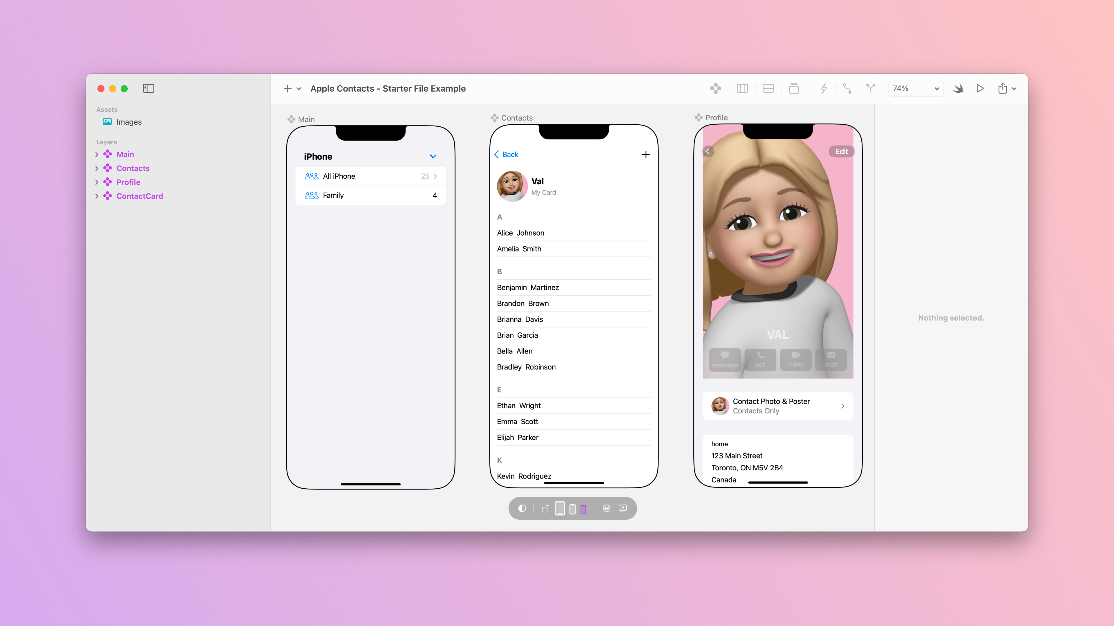
Our starter Judo file consists of 3 screens:
- Main - A screen that displays all of the contact lists.
- Contacts - A screen that displays all of the contacts in the “All iPhone” contact list.
- Profile - A screen that displays my contact details.
Every navigation hierarchy consists of a root screen, and screens that get presented on top of it. In this example, the root screen will be the Main screen that navigates to the Contacts screen and then the Profile screen.
1. Navigation Stack
To set up your app’s navigation, place a Navigation Stack around the content of your root screen, so you can present additional screens over it. Either insert it from the Insert (+) menu to the Lists component and drag the Form inside, or right-click on the Form to embed it in a Navigation Stack.
<div class="callout note">Note
A common misconception is that every screen requires its own Navigation Stack. In reality, only the root screen needs a Navigation Stack.</div>
Navigation screens can present new screens when users tap on a Navigation Link, which is a layer that users interact with to present a new screen.
Navigation Links consist of a Label and Destination parameter. The layer(s) placed in the Label parameter will dictate what a user needs to tap on to move to the next screen. The Destination parameter specifies the screen that the Navigation Link will navigate to when tapped.
2. Navigation Link Label
To get from the Main screen to the Contacts screen, users can click on the “All iPhone” contact list. Since the layer that a user needs to click on has already been created, you can turn it into a Label for the Navigation Link by selecting it in the Layers panel and clicking on the toolbar Navigation Link button.
<div class="callout note">Note
Alternatively, right-click the layer in the Layers panel and choose Make Navigational Link from the menu to turn it into a Label for the Navigation Link.</div>
Layers that make up the Label of a Navigation Link may change in appearance to signal that they are tappable. For example, since the HStack layer is situated in a Form, a right chevron symbol now appears on the Trailing edge.
3. Navigation Link Destination
To specify where the Navigation Link should take a user, insert an instance of the component that you want the link to navigate to in the Destination parameter. In this case, we’ll copy the Contacts screen to paste an instance of it in the Main component.
Pro Tip
Use the keyboard shortcut ⌘C to copy and ⌘V to paste.
Navigation Modifiers
When navigating through a navigation hierarchy, users can navigate forward with Navigation Links or backward through built-in, platform-appropriate controls, like a Back button or a swipe gesture, for example. But, how do they know what screen they’re on?
1. Navigation Title
A screen’s Navigation Title is used to visually display the name of the current navigation screen in the Navigation Bar.
Every screen in a navigation hierarchy can have its own title. To add one, apply the Navigation Title modifier to a layer inside the navigation screen. If a screen has a Navigation Stack, make sure you place the Navigation Title modifier on a layer within the stack rather than on the stack itself.
<div class="callout app">Preview Your App
Let’s preview the build on the Judo mobile app to see how it works.</div>
Currently, the Navigation Title on the Contacts screen is displayed just as it is on the Main screen. By default, the display style is inherited from the settings of the previous screen, and will transition to Inline on scroll, unless otherwise specified.
2. Navigation Bar Title Display
You can customize the way the title is shown in the Navigation Bar with the Navigation Bar Title Display modifier. There are 3 options to choose from:
- Automatic - This is the default option. It inherits the style used on the previous screen.
- Inline - This option shrinks the Navigation Bar, displaying the title in a smaller format.
- Large - This option expands the Navigation Bar, displaying the title in a larger format by default and then transitioning to Inline on scroll, just as in the video above.
In this example, the title on the Main screen is set to Large, while the title on the Contacts screen is set to Inline. To configure this on the canvas, apply the Navigation Bar Title Display modifier to a layer inside the navigation screen. If a screen has a Navigation Stack, make sure you place the Navigation Bar Title Display modifier on a layer within the stack rather than on the stack itself.
In some instances, you may want to remove the Navigation Bar altogether. You can accomplish this with the Navigation Bar Hidden modifier.
3. Navigation Bar Hidden
The Profile screen already has a custom Navigation Bar, so the built-in Back button in the Navigation Bar distorts the layout and complicates the navigation experience.
To control whether the entire Navigation Bar gets displayed or hidden, apply the Navigation Bar Hidden modifier to a layer inside a navigation screen. If a screen has a Navigation Stack, make sure you place the Navigation Bar Hidden modifier on a layer within the stack rather than on the stack itself.
Send the file to your phone to preview the changes.
4. Navigation Bar Back Button Hidden
By default, when users navigate through an app, a navigation screen will always display a Back button so they can go back to the previous screen.
You can override this behavior with the Navigation Bar Back Button Hidden modifier.
While the final navigation modifier that you can apply is not present in Apple’s Contacts app, it can be extremely useful when you want a user to take an action before moving back to the previous screen. For instance, you can hide the Back button until a specific action is completed.
To hide the Back button, apply the Navigation Bar Back Button Hidden modifier to a layer inside your navigation screen.
To see the changes you made, send your file to your mobile device. Now users will not be able to go back to the previous screen.
<hr>
Before we take a look at some of the ways that you can customize your Navigation Bar, let’s check out some of the code that Judo generated for the root screen.
The root <code>struct Main</code> screen contains a <code>NavigationStack</code> which is used to manage navigation within the hierarchy. This screen contains a <code>NavigationLink</code> with the destination parameter set to <code>Contacts()</code>, taking users to that screen upon tap.
After the closing bracket of the <code>Form</code>, every modifier that we added begins with a period, followed by its name in camel case. Inside of the parentheses, you’ll find a set of arguments or parameters that we specified in the Judo canvas. For example, this screen contains a <code>navigationTitle</code> that sets the title in the Navigation Bar to <code>Lists</code>.
<hr>
Adding Buttons to the Navigation Bar
Navigation Bars often have buttons on the Leading and Trailing sides. To add buttons to the Navigation Bar, use the Toolbar Item modifier.

The Toolbar Item modifier comes with a Placement, Title, Icon, and Actions parameter, so you can choose where to place your button in the Navigation Bar and the action that a user can take when they tap on it.
On the Main screen, there are two Toolbar Items: an “Edit” and an “Add List” button. For each item, insert the Toolbar Item modifier to a layer on the screen and configure the parameters. The “Edit” button is placed on the Leading edge and the Title is set to Edit. The “Add List” item is placed on the opposite Trailing edge with the Title set to Add List instead.
Toolbar Items will be black until you add an action. To do so, click on the plus (+) icon in the Actions section.
Customizing the Look of the Toolbar
The Contacts app uses a default appearance, but there are a variety of modifiers that you can apply to customize the Navigation Bar. Just like with each navigation modifier, every Toolbar modifier must be applied to a layer within a navigation screen, so each screen can be designed differently. If a screen has a Navigation Stack, make sure you place the modifier on a layer within the stack instead of the stack itself.
1. Toolbar Background Visibility

By default, a Toolbar’s background is not visible until you start scrolling. With the Toolbar Background Visibility modifier, you can override this default behavior to make the Navigation Bar either Visible or Hidden at all times.
Add this modifier once to a layer in your navigation screen if you want to apply the same Visibility parameters for both the Navigation and Tab Bar. Otherwise, insert the modifier for each Bar and adjust the parameters accordingly.
2. Toolbar Background Color

If your Toolbar Background is set to Visible, you can customize the color of your Navigation bar, Tab bar, or both from the Inspector panel.
Add the Toolbar Background Color modifier once to a layer in your navigation screen if you want to apply the same Color parameters for both the Navigation and Tab Bar. Otherwise, insert the modifier for each Bar and adjust the parameters accordingly.
3. Toolbar Background Color Scheme

Last but not least, you can customize the preferred color scheme of a Navigation and/or Tab Bar.
By default, a Toolbar’s color scheme automatically adapts to a user’s display settings, switching between Light and Dark mode. With the Toolbar Color Scheme modifier, you can override this behavior by configuring the color scheme to stay fixed in either Light or Dark mode, regardless of a user’s display settings. This modifier comes in handy when you’re using a dark background because you can force the text to always stay white by setting the Scheme to Dark.
Add the Toolbar Background Color Scheme modifier once to a layer in your navigation screen if you want to apply the same Scheme parameters for both the Navigation and Tab Bar. Otherwise, insert the modifier for each Bar and adjust the parameters accordingly.
There you have it! Don’t forget to send your design to the Judo mobile app to see your complete build in action.
Ask Our Community
If you have questions about the Judo editor, or developer questions about SDK integration, join the community and start a conversation!


