Fundamentals
The Ultimate Guide to Stacks & Spacers
HStack, VStack, and ZStack, along with Spacer, are foundational elements of all SwiftUI layouts. Let's break each one down by building a basic search bar that contains 4 stacks and 1 spacer.

Just as their names suggest, HStacks and VStacks arrange their layers horizontally and vertically. A ZStack allows you to place layers on top of one another while Spacers add some breathing room to your layout.
These structures are flexible and easily adaptable as they automatically adjust to varying screen dimensions, text size preferences, and different languages—even those that read from right to left.
Take a look at this simple search bar. It’s made up of 4 different stacks and a 1 spacer. Can you spot them all?

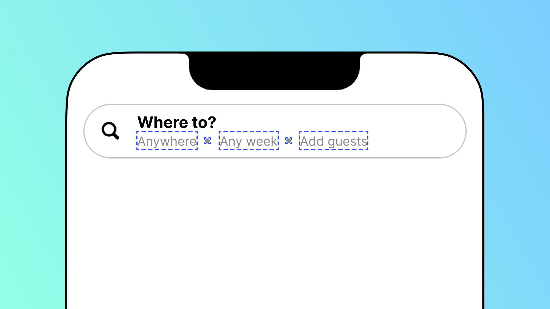
The <span style="color:blue;">first stack</span> in this search bar is an HStack which contains 3 Text layers and 2 icons arranged horizontally.
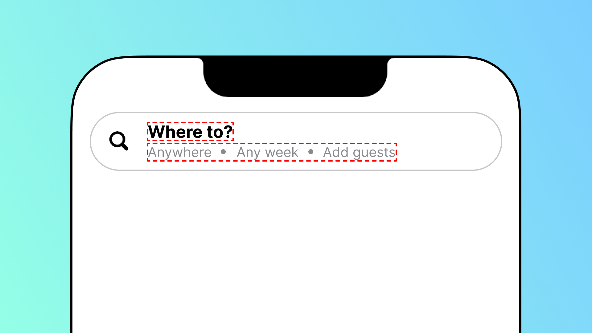
The <span style="color:red;">second stack</span> is a VStack which contains a Text layer and the HStack from before, arranged vertically.
The <span style="color:green;">third stack</span> is an HStack that consists of an image layer, the VStack from before, and a Spacer, all arranged horizontally.

The fourth stack is a ZStack which consists of an <span style="color:purple;">HStack</span> overlaying a <span style="color:orange;">capsule</span>.
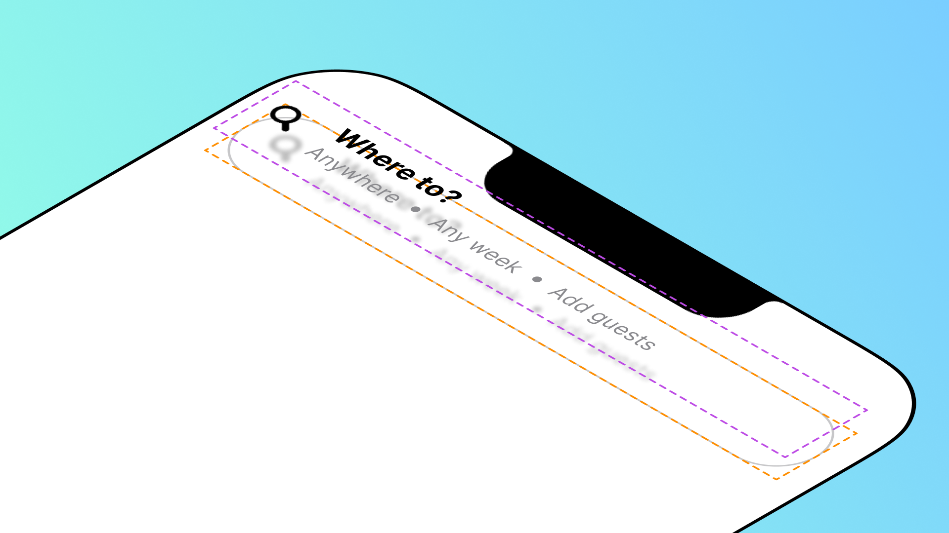
As you can see, not only can you build a variety of stacks, but you can also embed them into other stacks, too.
I know it may seem a bit confusing at first, but with this step-by-step breakdown, I’m confident that stacks and spacers will become second nature to you in no time. After all, you can’t do much without them!
Let’s start with a clean canvas and rebuild this search bar in Judo.
1. HStack

The first stack is an HStack, or a horizontal stack. This layer allows you to stack layers horizontally.
Start out by creating a New Component from the Insert + menu to insert a screen that you will build in. Then, to add the 3 Text layers, select the component in the Layers panel and click on the Insert + button to add each Text layer from the menu.
Pro Tip
With the component selected, you can also add a Text layer by pressing the letter "t" on your keyboard.
At first, all 3 layers will be arranged on top of one another, so to arrange them horizontally, embed the 3 Text layers into an HStack by selecting all of them in the Layers panel, right-clicking, and selecting Embed in HStack.
Pro Tip
With all the relevant layers selected, you can also embed them into an HStack with the ⌘⇧H keyboard shortcut.
<div class="callout note">Note
By default, an HStack uses Center alignment to arrange the centers of all of its children vertically, but you can set it to Top, Bottom, or Text Baseline alignment from the Inspector panel.</div>
Now all 3 Text layers will be arranged horizontally with an equal spacing of 8 points between each one. Stacks choose their own size based on their children, so when you change the spacing of the HStack in the Inspector panel, the size of the stack will follow suit.
As your HStack expands or contracts, the layers inside adapt to the space offered, and in the case of a Text layer, they’ll move to the next line if they need more room. If you want to limit the number of lines that a Text layer can expand or contract to, you can add the Line Limit modifier to adjust the limits.
<div class="callout note">Note
Modifiers cascade down your stacks, so if you add a modifier such as the Line Limit to your HStack, every layer inside it will also inherit the parameters of the modifier. This way, you don’t have to add the same modifier to each layer.</div>
A stack can only take up the maximum space offered to it by its parent, so its children adapt to the frame size by truncating equally based on the space available while still ensuring that the spacing set in the Inspector panel is present in the HStack.
If you don’t want each layer to truncate equally, you can add the Layout Priority modifier to raise the layout priority of a layer.
Since I raised the layout priority of the first Text layer to 1, it is offered all the available space in the frame, minus the minimum space required for the others and the spacing of the HStack.
Now, let’s bring the spacing back to 8 points to get back to the design of our search bar. In this HStack, we are missing a circle between the first two layers and the last two. To add a circle between your first and second Text layers, select the first Text layer in the HStack, and from the Insert + menu, insert a Symbol from the Images section.
Then, from the Inspector panel, choose the <code>circle.fill</code> shape.
With the Image selected in the Layers panel, you can adjust its size by adding a Font modifier to it from the Inspector panel.
Since we need the exact same dot to appear between the second and third Text layers, right click the Image in the Layers panel and click Duplicate. You can drag layers around in the panel to place them in the right order.
Pro Tip
You can also duplicate a layer with the ⌘D keyboard shortcut.
In our example, our font size is smaller across all the Text layers and the color of all the layers is a shade of gray. With the HStack selected in the Layers panel, you can add a Font and Foreground Color modifier to it from the Inspector panel. This way, all the layers within it will inherit its parameters.
<div class="callout note">Note
Any modifiers added to the layers inside of a stack will override the parameters set for the same modifiers on the stack. Take, for instance, the dots. Since we already gave them a custom font size of 4 points, they won’t inherit the size we choose for the HStack.</div>
<hr>
Before we move forward, let’s take a look at the SwiftUI code generated by Judo.
The 3 <code>Text</code> layers and the 2 <code>Image</code> layers that we inserted are embedded inside of an <code>HStack</code> and complete with a text string in double quotations, illustrating the text or SF Symbol to use.
Some of the layers inside of the <code>HStack</code> have a modifier underneath. Modifiers start with a dot and are followed by their name in camel case and their parameters in parentheses.
After the closing bracket of the <code>HStack</code>, you’ll find all of the modifiers that we added directly to the HStack layer, ensuring that all the layers inside inherit the same parameters.
<hr>
2. VStack

To build the VStack, or a vertical stack, we’ll need to create another Text layer so that we can stack it on top of the HStack we just built.
With your component selected in the Layers panel, insert a Text layer from the Insert + menu and change the text from the Inspector panel.
At first, both layers will be arranged on top of one another, so to arrange them vertically, embed them in a VStack by selecting all of them in the Layers panel, right-clicking, and selecting Embed in VStack.
Pro Tip
With all the relevant layers selected, you can also embed them with the ⌘⇧V keyboard shortcut.
With the new Text layer selected, you can customize the style by adding the Font and Bold modifiers to it from the Inspector panel.
Pro Tip
With a layer selected, you can also add the Bold modifier with the ⌘B keyboard shortcut.
By default, a VStack has a spacing of 8 points and uses center alignment to arrange the centers of all its children horizontally, but you can adjust those parameters from the Inspector panel.
In SwiftUI, we use the terms Leading and Trailing—instead of Left and Right—to refer to the beginning and end of a horizontal axis. In left-to-right languages, such as English, the Leading edge is the left side and the Trailing edge is the right side. However, in right-to-left languages, such as Arabic or Hebrew, this is reversed—the Leading edge is the right side and the Trailing edge is the left side.
When you build user interfaces with stacks and spacers, SwiftUI automatically adjusts the layout of your user interface depending on a user’s preferred language.
Watch how our search bar flips its orientation when we preview our design in a right-to-left language.
<hr>
Let’s take another look at the Code Inspector to see how the SwiftUI code has changed with the addition of our VStack.
Above our <code>HStack</code>, we now have have a <code>Text</code> layer with the <code>.font</code> and <code>.bold</code> modifiers. Both layers are embedded in a <code>VStack</code> with <code>.leading</code> alignment and a <code>spacing</code> of 2 points, which is exactly what we set up in the Judo canvas.
<hr>
3. Spacer

Now let’s build our final HStack by starting with the magnifying glass icon. With the component selected in the Layers panel, insert a Symbol from the Images section of the Insert + menu. Then, choose the <code>magnifyingglass</code> icon from the Inspector panel.
With the Image selected in the Layers panel, add the Bold modifier to it from the Inspector panel to make it appear thicker.
At first, the Image and VStack layers will be arranged on top of one another, so to arrange them horizontally, embed them in an HStack by selecting both in the Layers panel, right-clicking, and selecting Embed in HStack.
By default, stacks in SwiftUI take up the minimum space required by its children and aligns to the center. By adding a Spacer, you can push the content apart to use all of the available space offered horizontally or vertically by the parent of the stack.
To add a Spacer to the right of the VStack, select the VStack in the Layers panel and click on the Insert + button to add a Spacer. Now, all of your content in the HStack is Leading aligned.
Pro Tip
With the VStack selected, you can also insert a Spacer by pressing "s" on your keyboard.
Notice how when I move the Spacer around in the HStack, it stretches to fill the space regardless of where it is in the stack, pushing the content around it.
To give all the layers in the HStack some breathing room around the edges, add the Padding modifier to the HStack and only keep the Leading and Trailing edges selected.
<hr>
As always, before we go any further, let’s dive into the SwiftUI code.
There’s a new <code>Image</code> layer above the <code>VStack</code>, complete with the name of the SF Symbol and the <code>.bold</code> modifier that we had added to it.
You will also find the <code>Spacer()</code> layer after the closing bracket of the <code>VStack</code> layer, but before the closing bracket of the <code>HStack</code>. The <code>.padding()</code> modifier, on the other hand, comes after the closing bracket of the <code>VStack</code>, wrapping all the layers within.
<hr>
4. ZStack

To build the final stack, let’s start by creating the Capsule. With the component selected in the Layers panel, click on the Insert + menu to add a Capsule from the Shapes section.
With the Capsule selected in the Layers panel, you can add the Frame modifier from the Inspector panel to adjust its size.
You’ll notice that the Capsule is on top of our text. To adjust the order of layering, we can embed our layers in a ZStack.
To build a ZStack, or a layered stack, select the Capsule and HStack layers in the Layers panel, right-click, and select Embed in ZStack. You can adjust the z-order of your layers in the Layers panel.
Now that our Capsule is behind our text, let’s change it from a Fill to a Stroke to give our search field a rounded border appearance.
You’ll notice that our search bar extends all the way to the edges of the screen. We can improve this by wrapping the ZStack in a Padding modifier.
Our search bar is aligned in the middle of the screen. This is the default behavior in SwiftUI and in Judo. For our design, we want the search bar aligned at the top of the screen. Think back on what you’ve learned so far about stacks and spacers. How can we move the search bar to the top?
When we wanted our text aligned to the Leading edge, we used an HStack and a Spacer to push it to the left side. We can use a Spacer again to push our search bar to the top, but this time with a VStack.
<hr>
Here’s a breakdown of the final code in SwiftUI.
Our code begins with a <code>struct</code>, or “structure”, called <code>Component_1</code>, to define a separate view in our SwiftUI app. While the view is a screen in our case, it could also be a section of a screen.
The variable <code>body</code> is a property used to store our content. It contains the <code>VStack</code> that we just embedded all 4 of our stacks into and a <code>Spacer()</code> before the closing bracket of the <code>VStack</code> to push the search bar to the top of the screen.
It also has the recently created <code>ZStack</code> complete with our <code>HStack</code> and <code>Capsule()</code>. After the closing bracket of our <code>ZStack</code>, you will also find the <code>.padding</code> modifier that we added to give our search bar some breathing room.
<hr>
Congrats on building a search bar in SwiftUI that automatically adapts to different screen dimensions, text size preferences, and right-to-left languages—all without any extra effort!
Ask Our Community
If you have questions about the Judo editor, or developer questions about SDK integration, join the community and start a conversation!


